Chapter 4 Multiple Component Analysis
4.1 Description
Multiple correspondence analysis (MCA) is an extension of correspondence analysis(CA) which allows one to analyze the pattern of relationships of several categorical dependent variables. As such, it can also be seen as a generalization of principal component analysis when the variables to be analyzed are categorical instead of quantitative. Because MCA has been (re)discovered many times, equivalent methods are known under several different names such as optimal scaling, optimal or appropriate scoring, dual scaling, homogeneity analysis,scalogram analysis, and quantification method.
Interpreting MCA Multiple correspondence analysis locates all the categories in a Euclidean space.
- The first two dimensions of this space are plotted to examine the associations among the categories.
- The top-right quadrant of the plot shows the categories.
- The bottom-left quadrant shows the association.
- This interpretation is based on points found in approximately the same direction from the origin and in approximately the same region of the space. Distances between points do not have a straightforward interpretation.
4.2 Density Plot
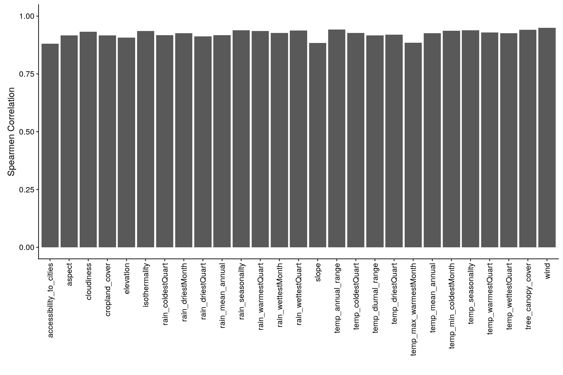
Let’s observe the distribution of each variables to get an intuition of how we can bin these variables. It’s important to have nearly equal number of observations in the each bin and to try to cut the variables in a way to so that each new binned distribution is nearly Gaussian. We can also verify that our binning is appropiate by calculating Spearman Correlation for each of original variable and binned variable, the correlation coefficient should be close to 1.

4.3 Binning
Structure of Data after binning based on above observation.
## 'data.frame':    137 obs. of  27 variables:
##  $ accessibility_to_cities: Factor w/ 3 levels "1","2","3": 2 1 3 2 2 1 3 1 1 1 ...
##  $ elevation              : Factor w/ 3 levels "1","2","3": 3 2 2 3 2 3 2 3 2 1 ...
##  $ aspect                 : Factor w/ 3 levels "1","2","3": 3 3 3 2 1 3 3 2 1 2 ...
##  $ slope                  : Factor w/ 3 levels "1","2","3": 3 3 1 1 1 3 1 2 2 1 ...
##  $ cropland_cover         : Factor w/ 3 levels "1","2","3": 1 2 1 1 2 2 1 2 2 3 ...
##  $ tree_canopy_cover      : Factor w/ 3 levels "1","2","3": 1 2 1 2 1 1 1 3 1 2 ...
##  $ isothermality          : Factor w/ 3 levels "1","2","3": 1 1 2 2 2 1 2 1 1 2 ...
##  $ rain_coldestQuart      : Factor w/ 3 levels "1","2","3": 1 3 1 1 1 1 1 2 1 1 ...
##  $ rain_driestMonth       : Factor w/ 3 levels "1","2","3": 1 3 1 1 2 2 1 3 2 1 ...
##  $ rain_driestQuart       : Factor w/ 3 levels "1","2","3": 1 2 1 1 1 1 1 3 1 1 ...
##  $ rain_mean_annual       : Factor w/ 3 levels "1","2","3": 1 2 1 2 2 2 1 2 1 3 ...
##  $ rain_seasonailty       : Factor w/ 3 levels "1","2","3": 3 1 2 3 1 1 2 1 1 3 ...
##  $ rain_warmestQuart      : Factor w/ 3 levels "1","2","3": 1 2 1 3 2 2 2 3 1 3 ...
##  $ rain_wettestMonth      : Factor w/ 3 levels "1","2","3": 1 2 1 2 1 1 1 2 1 3 ...
##  $ rain_wettestQuart      : Factor w/ 3 levels "1","2","3": 1 2 1 2 1 1 1 2 1 3 ...
##  $ temp_annual_range      : Factor w/ 3 levels "1","2","3": 3 2 3 2 2 3 2 2 3 2 ...
##  $ temp_coldestQuart      : Factor w/ 3 levels "1","2","3": 1 2 2 3 2 1 2 1 2 3 ...
##  $ temp_diurnal_range     : Factor w/ 3 levels "1","2","3": 3 1 3 2 2 2 2 1 1 1 ...
##  $ temp_driestQuart       : Factor w/ 3 levels "1","2","3": 3 2 3 2 2 1 2 1 2 2 ...
##  $ temp_max_warmestMonth  : Factor w/ 3 levels "1","2","3": 2 2 3 2 2 1 3 1 2 2 ...
##  $ temp_mean_annual       : Factor w/ 3 levels "1","2","3": 1 1 2 2 2 1 2 1 1 3 ...
##  $ temp_min_coldestMonth  : Factor w/ 3 levels "1","2","3": 1 1 2 2 2 1 2 1 1 3 ...
##  $ temp_seasonality       : Factor w/ 3 levels "1","2","3": 3 2 3 1 2 3 2 2 3 2 ...
##  $ temp_warmestQuart      : Factor w/ 3 levels "1","2","3": 2 1 3 2 2 1 3 1 2 3 ...
##  $ temp_wettestQuart      : Factor w/ 3 levels "1","2","3": 1 1 2 2 2 1 2 1 1 3 ...
##  $ wind                   : Factor w/ 4 levels "1","2","3","4": 3 2 4 2 4 1 4 2 2 2 ...
##  $ cloudiness             : Factor w/ 3 levels "1","2","3": 1 2 1 2 2 2 1 3 2 2 ...
4.4 Spearman Correlation
Let’s observe correlation between original data and binned data to make sure that neither the correlation ceofficient is too low or perfect.
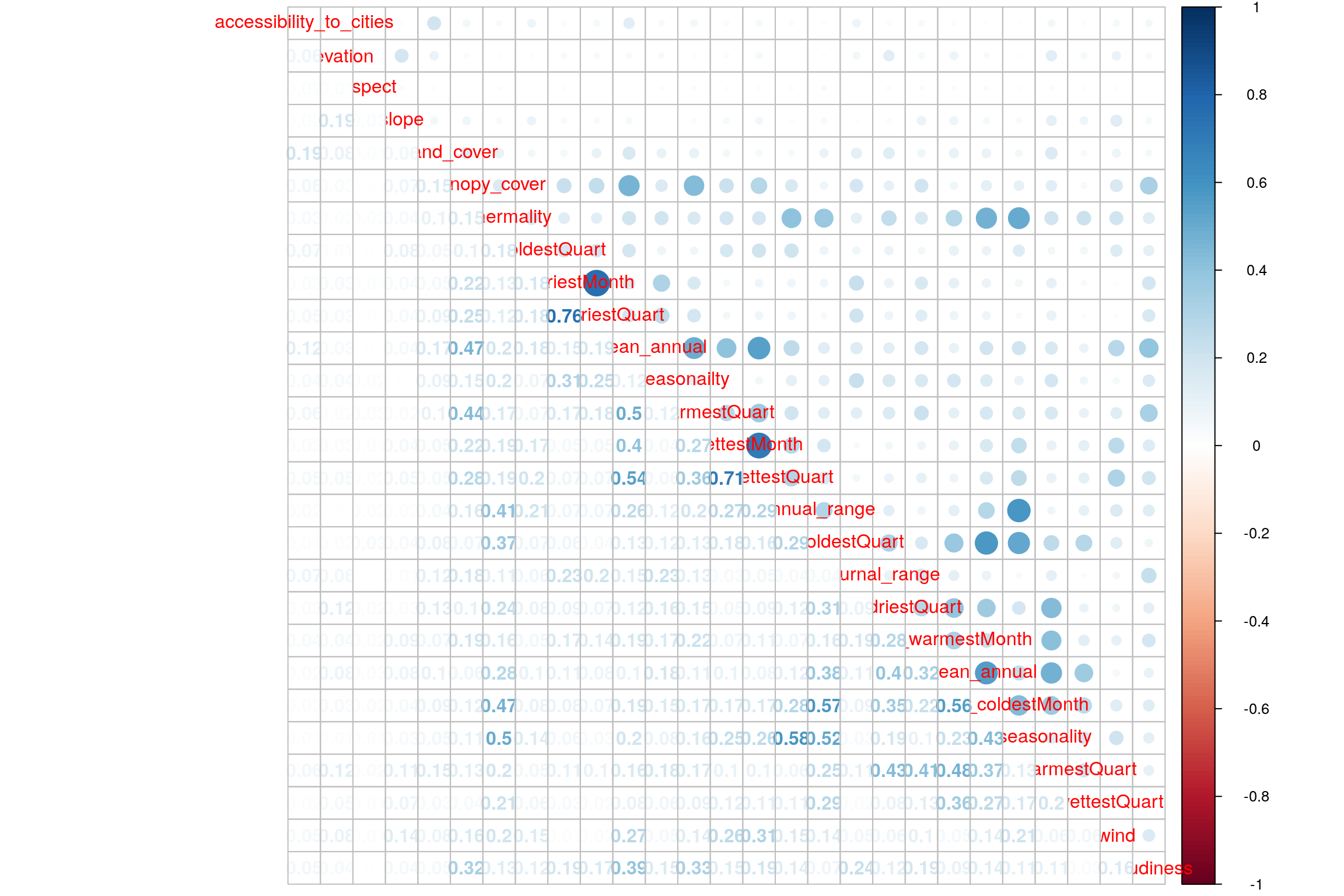
4.5 Heatmap
- For binned data
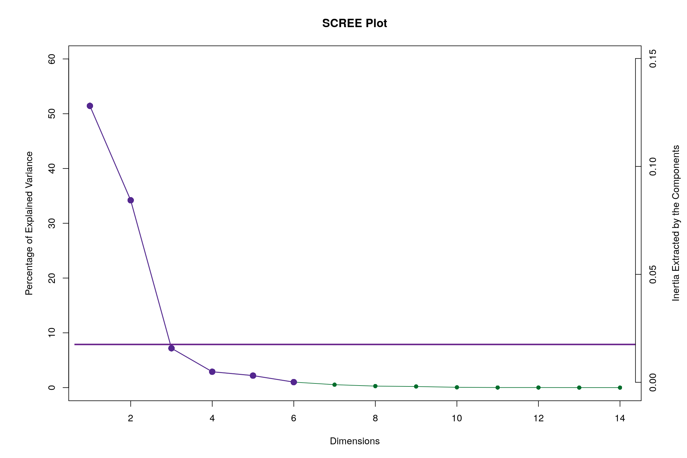
4.6 Scree Plot
Gives amount of information explained by corresponding component. Gives an intuition to decide which components best represent data in order to answer the research question.
P.S. The most contribution component may not always be most useful for a given research question.
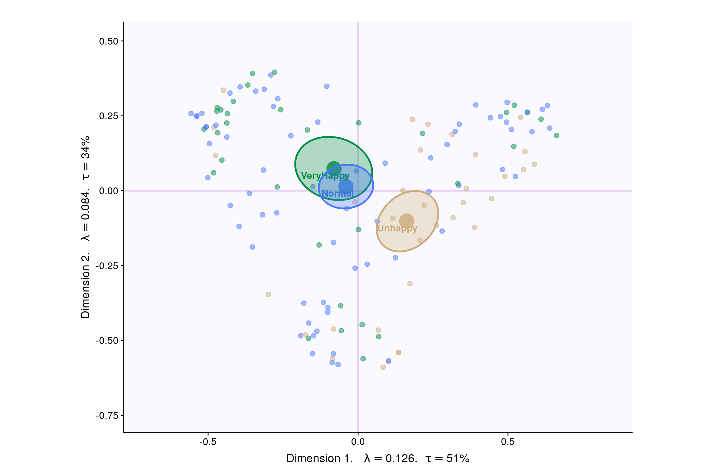
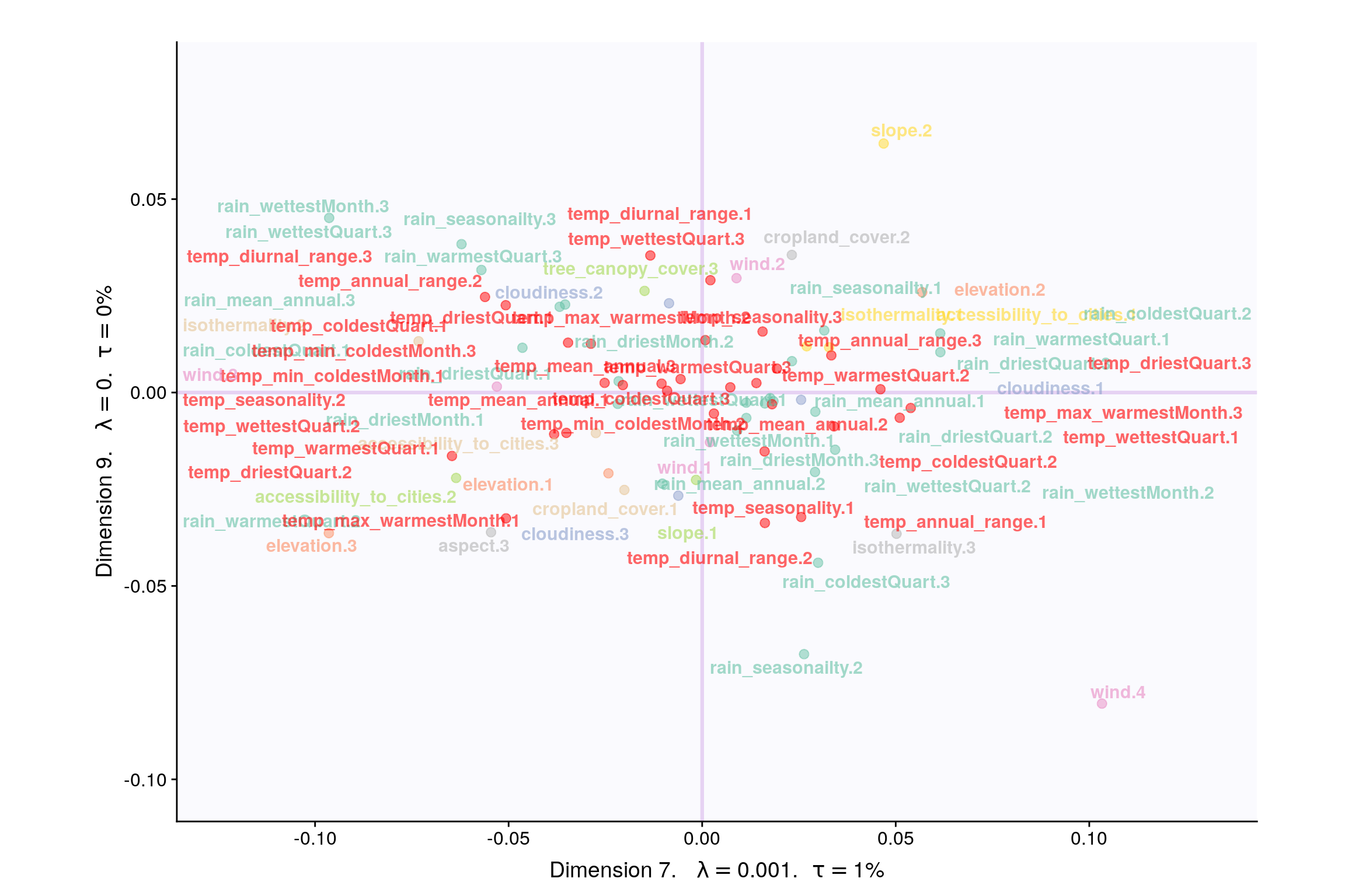
4.7 Factor Scores
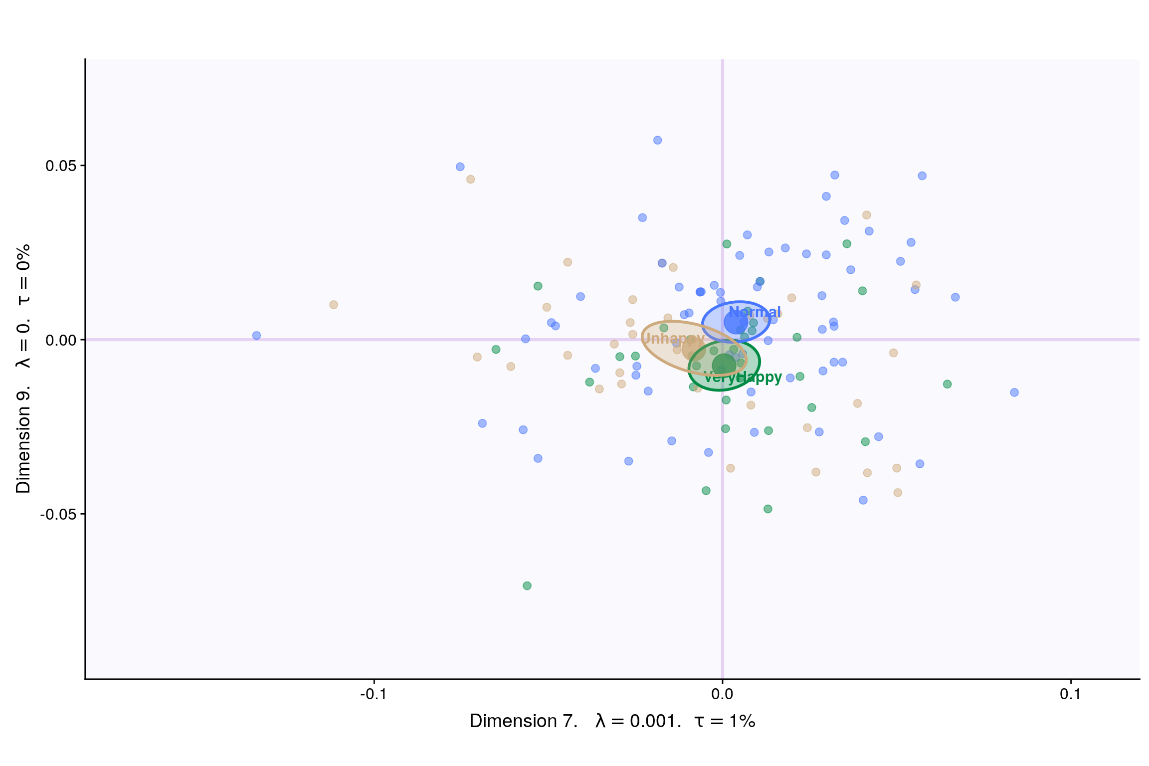
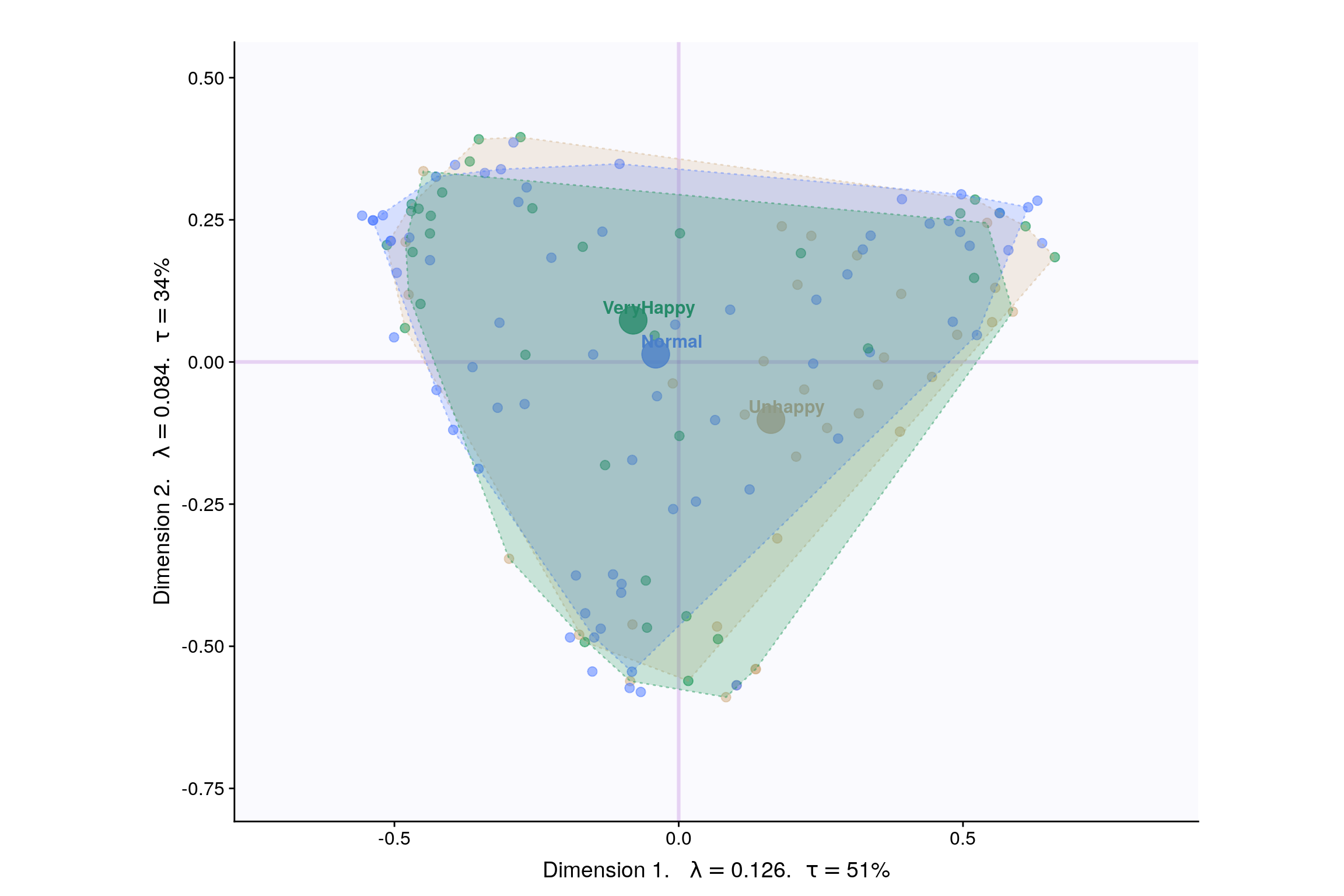
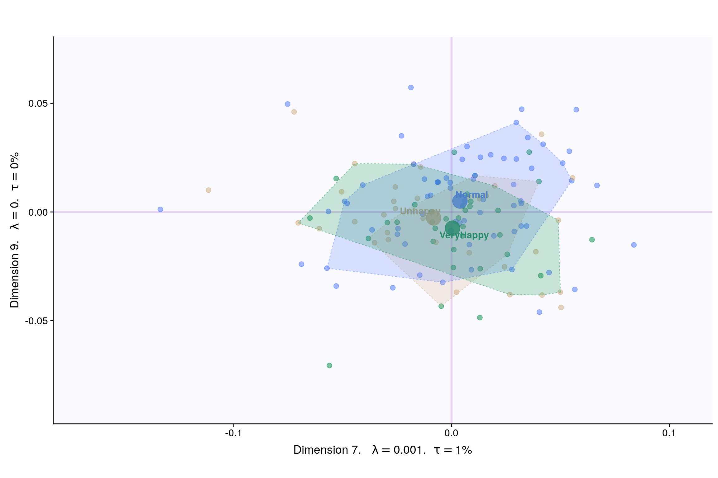
Lets visualize happiness categories for components 1-10, to make a decision (visually) on the most important components.
With Confidence Interval
With Tolerance Interval
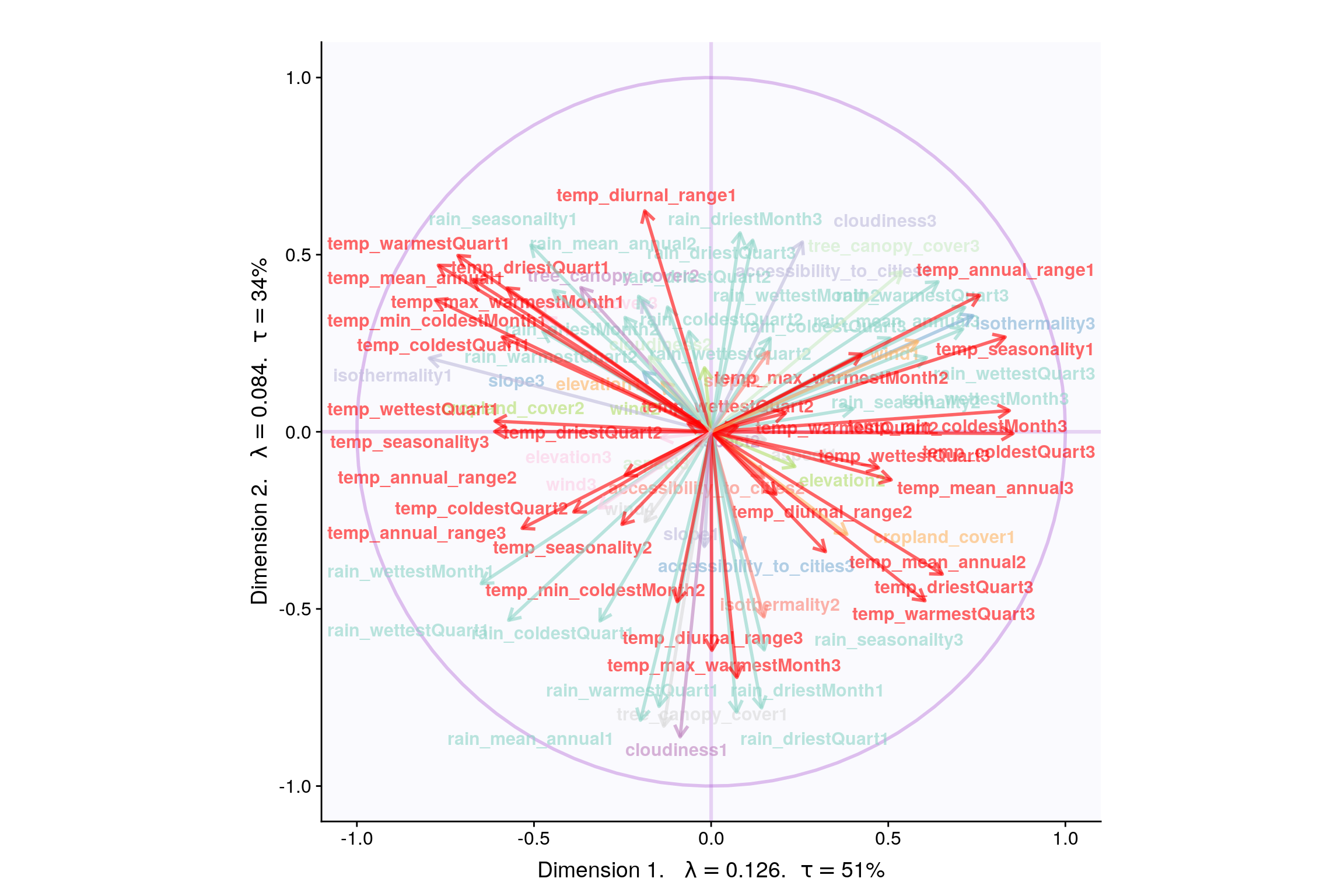
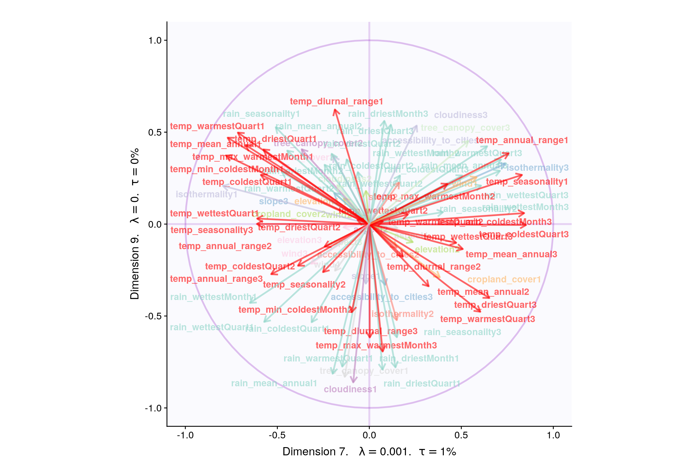
4.8 Loadings
4.9 Loadings (correlation plot)
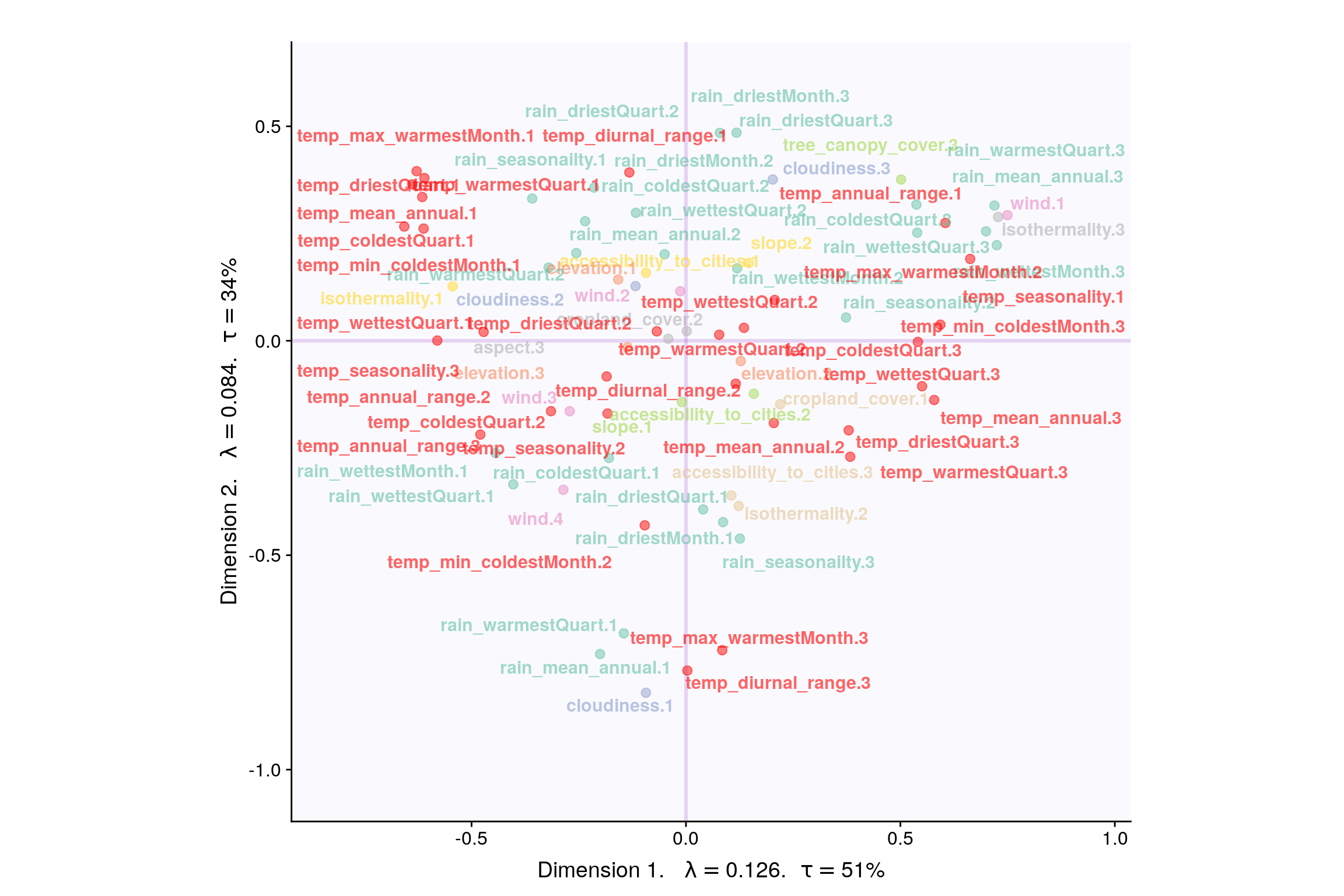
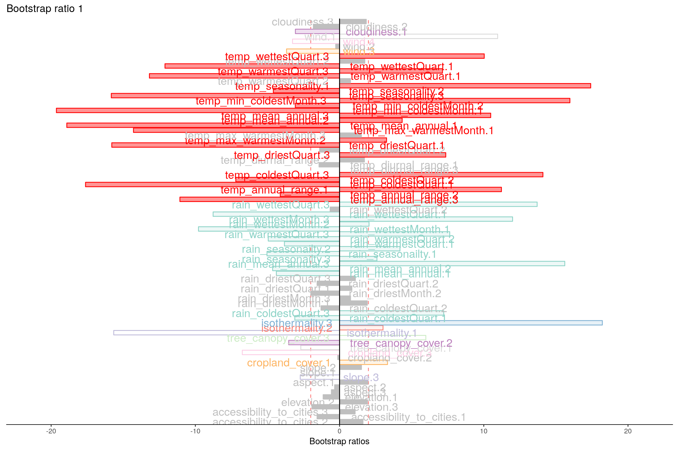
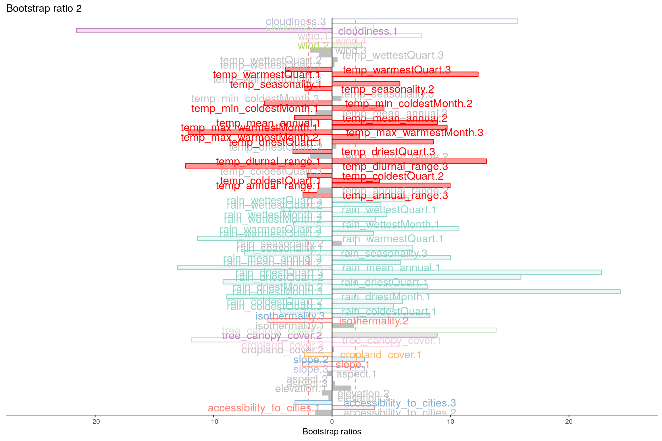
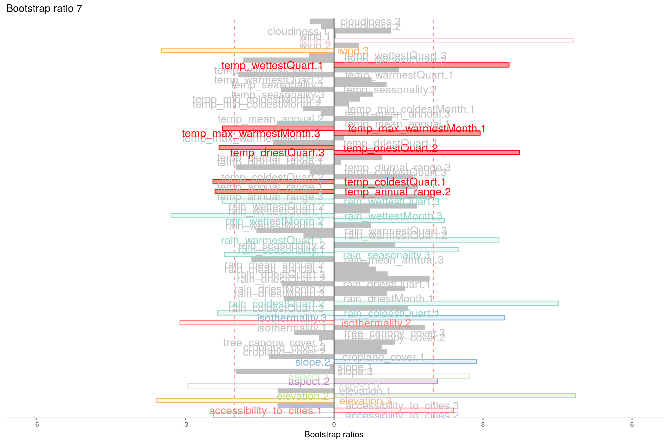
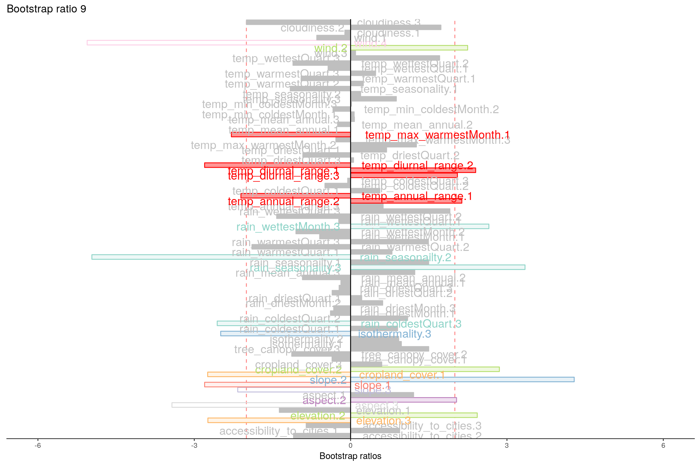
4.10 Most Contributing Variables (Inference)
Let’s plot variable contributions against each chosen components i.e. 1, 2, 7, 9.
With Bootstrap Ratio
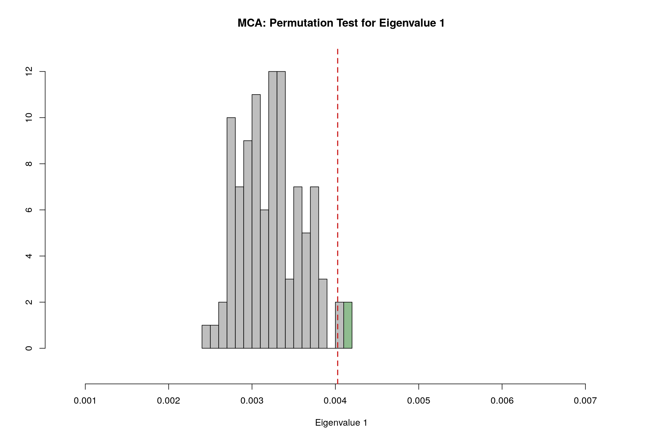
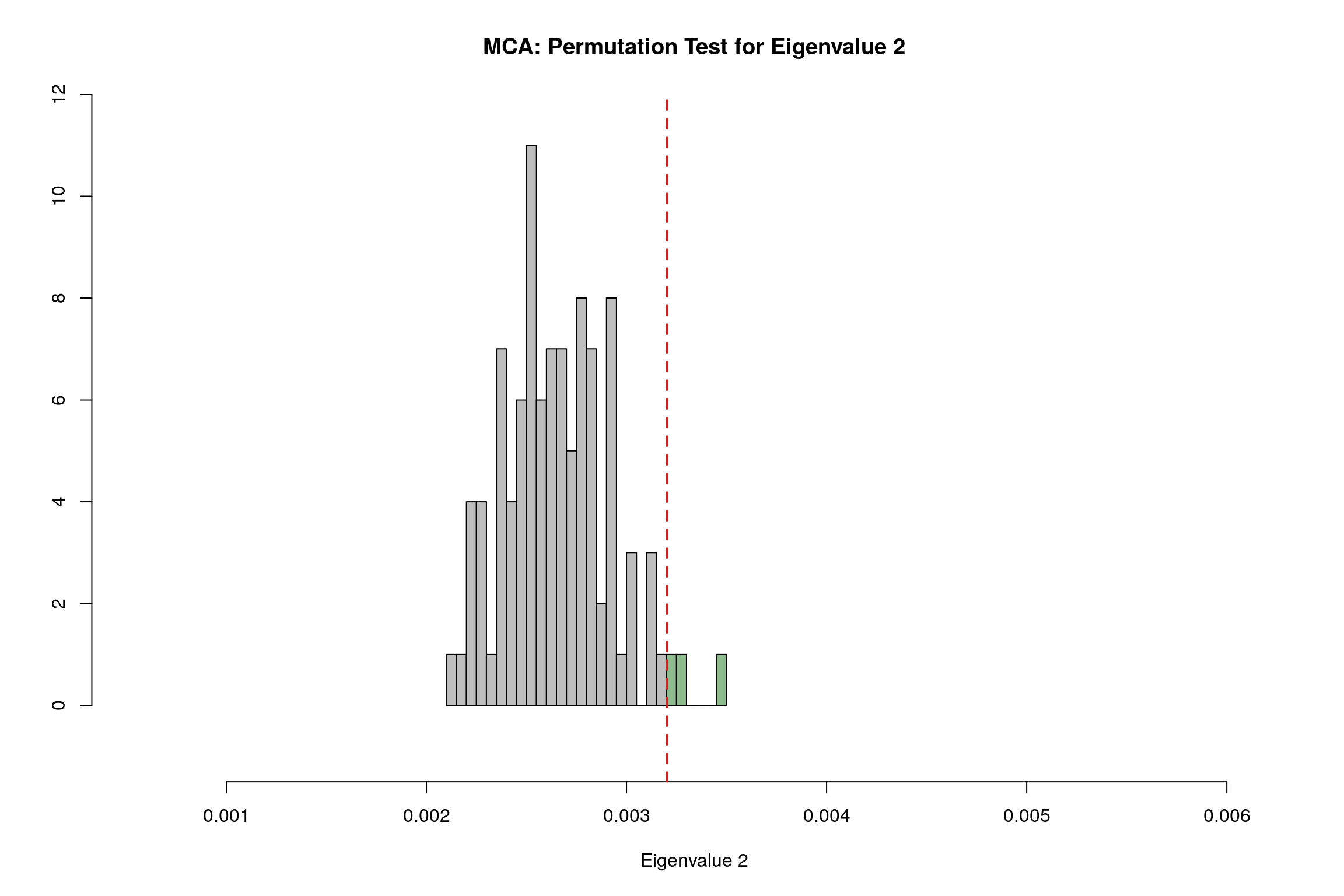
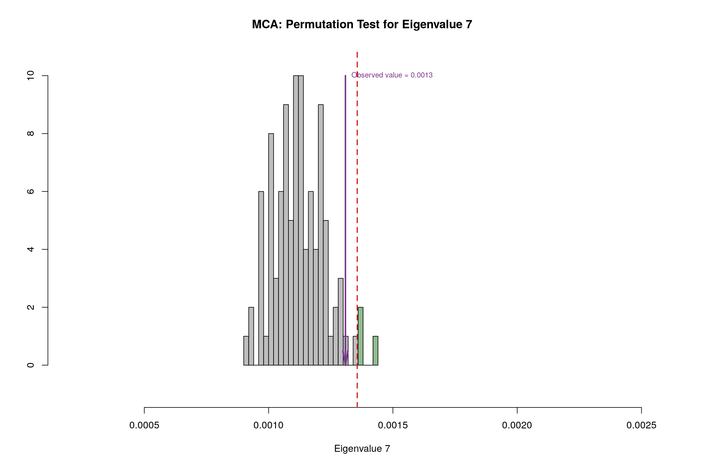
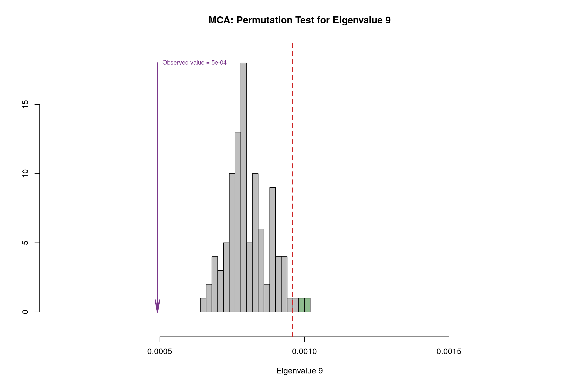
4.11 Permutation Test
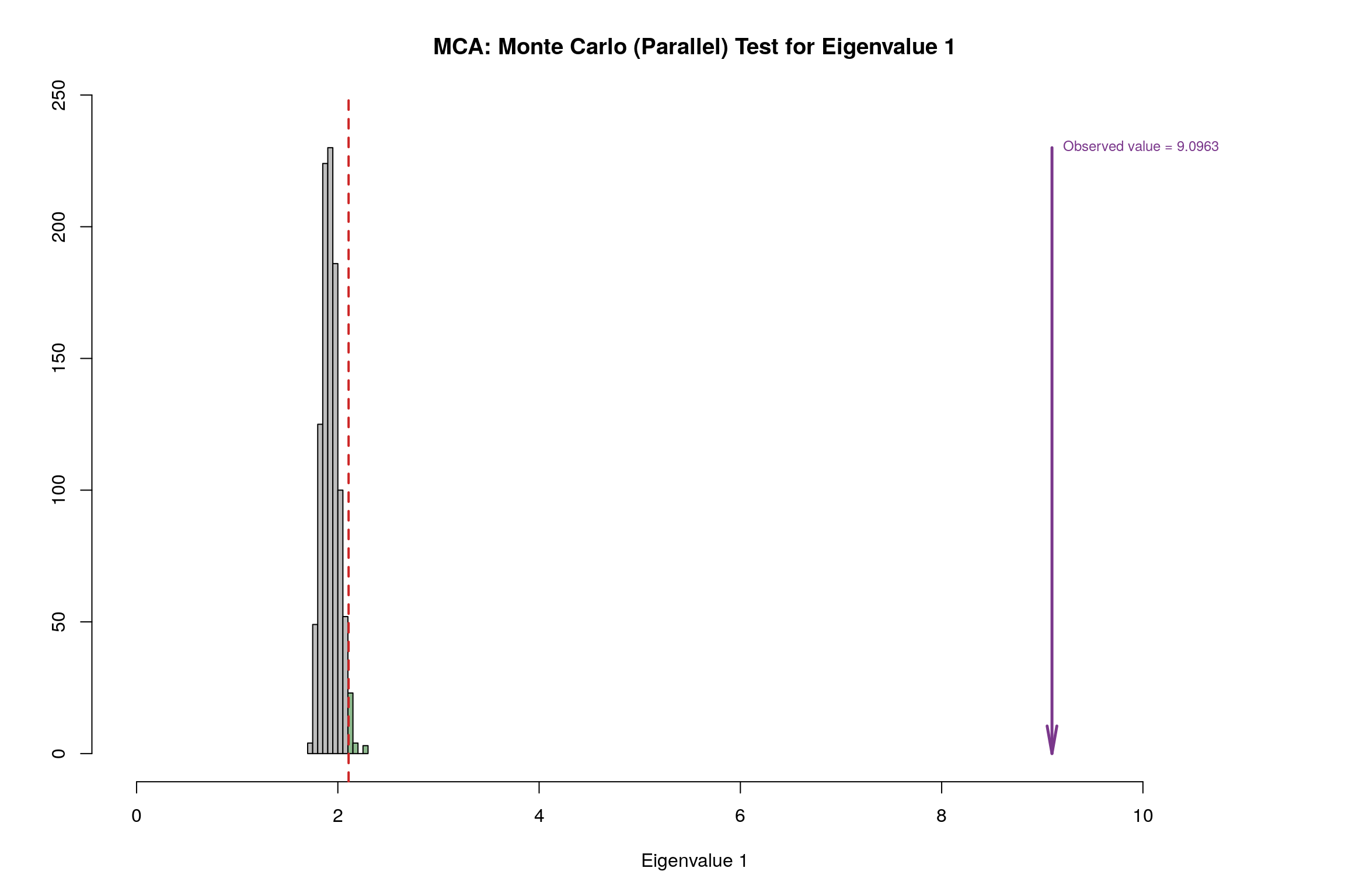
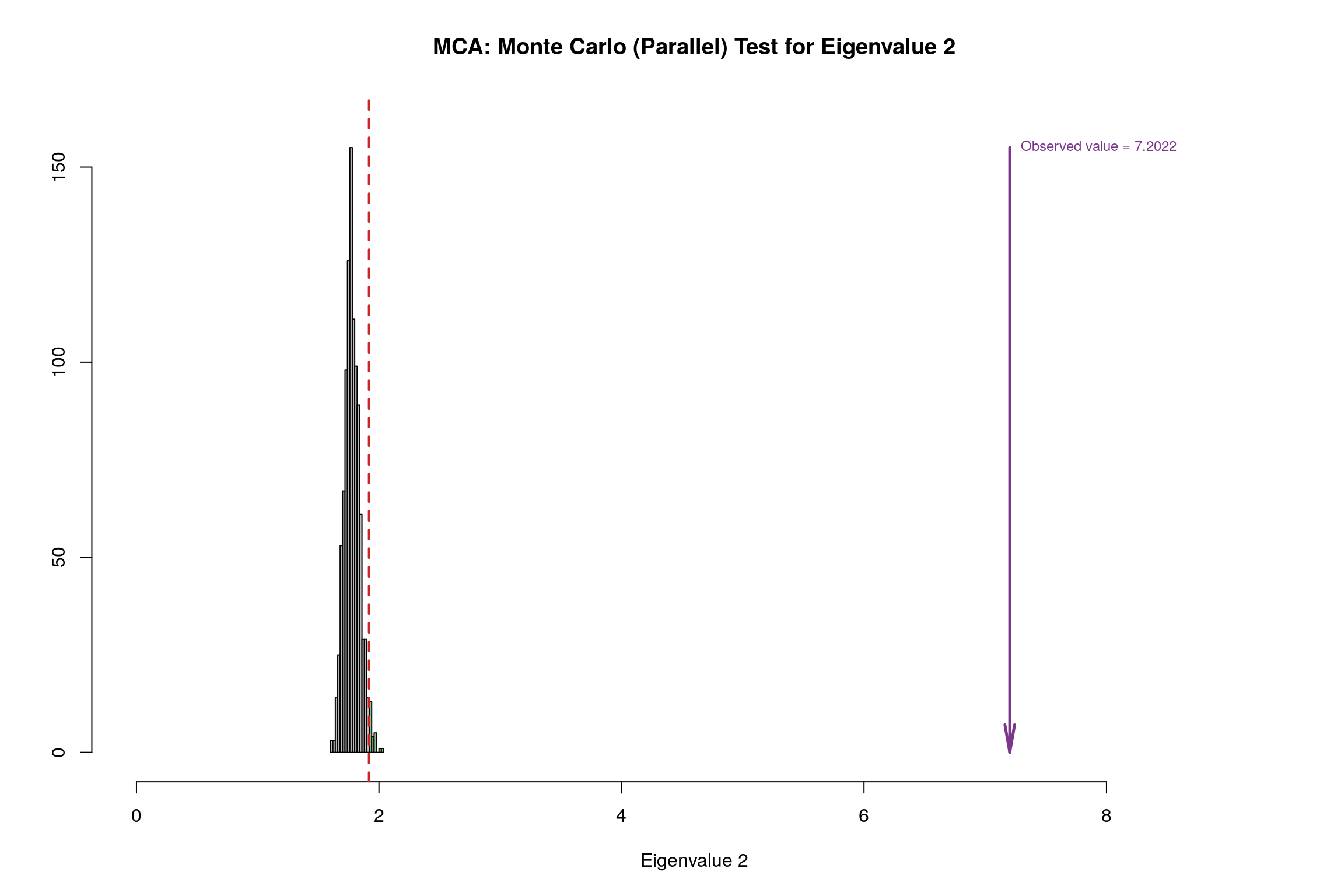
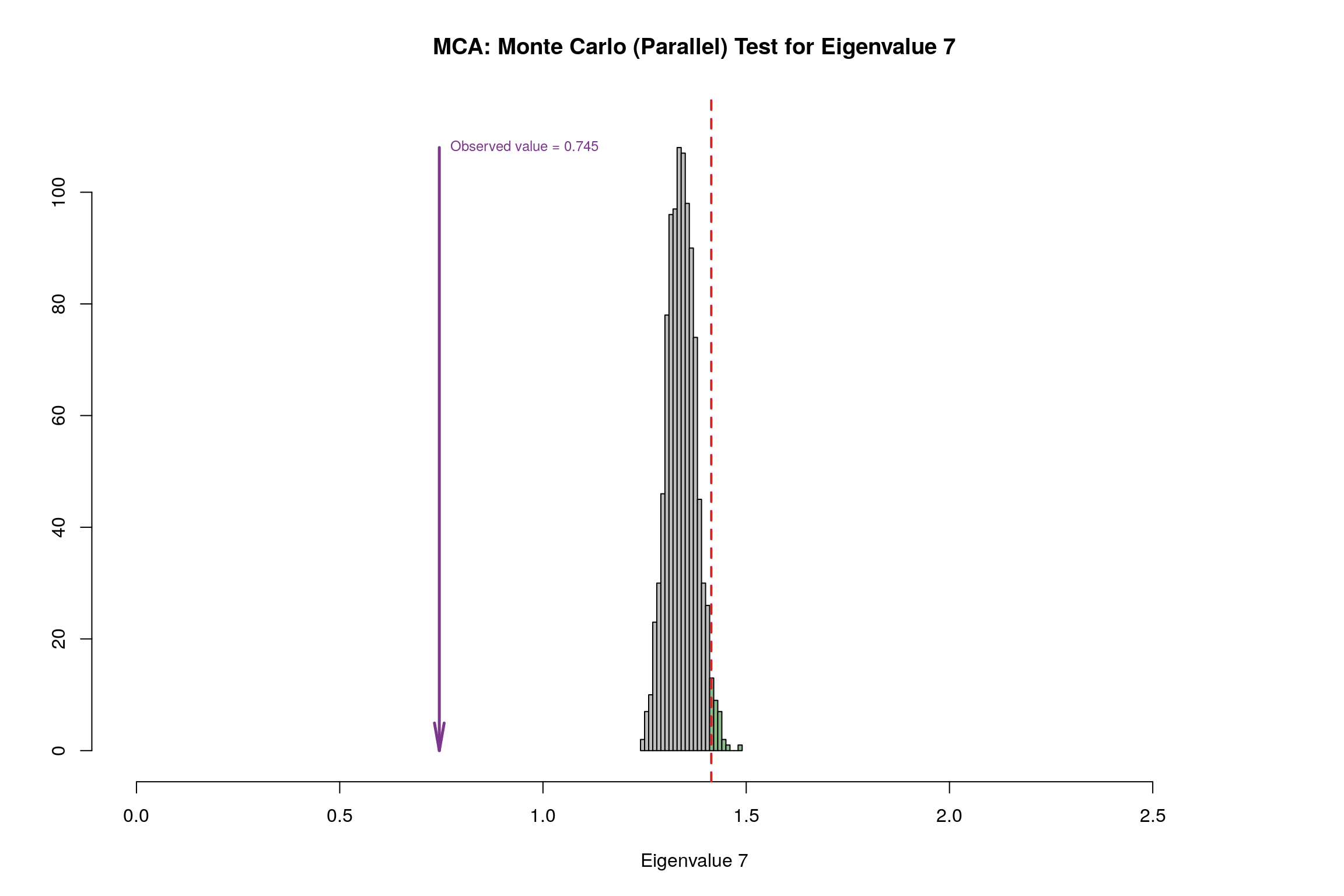
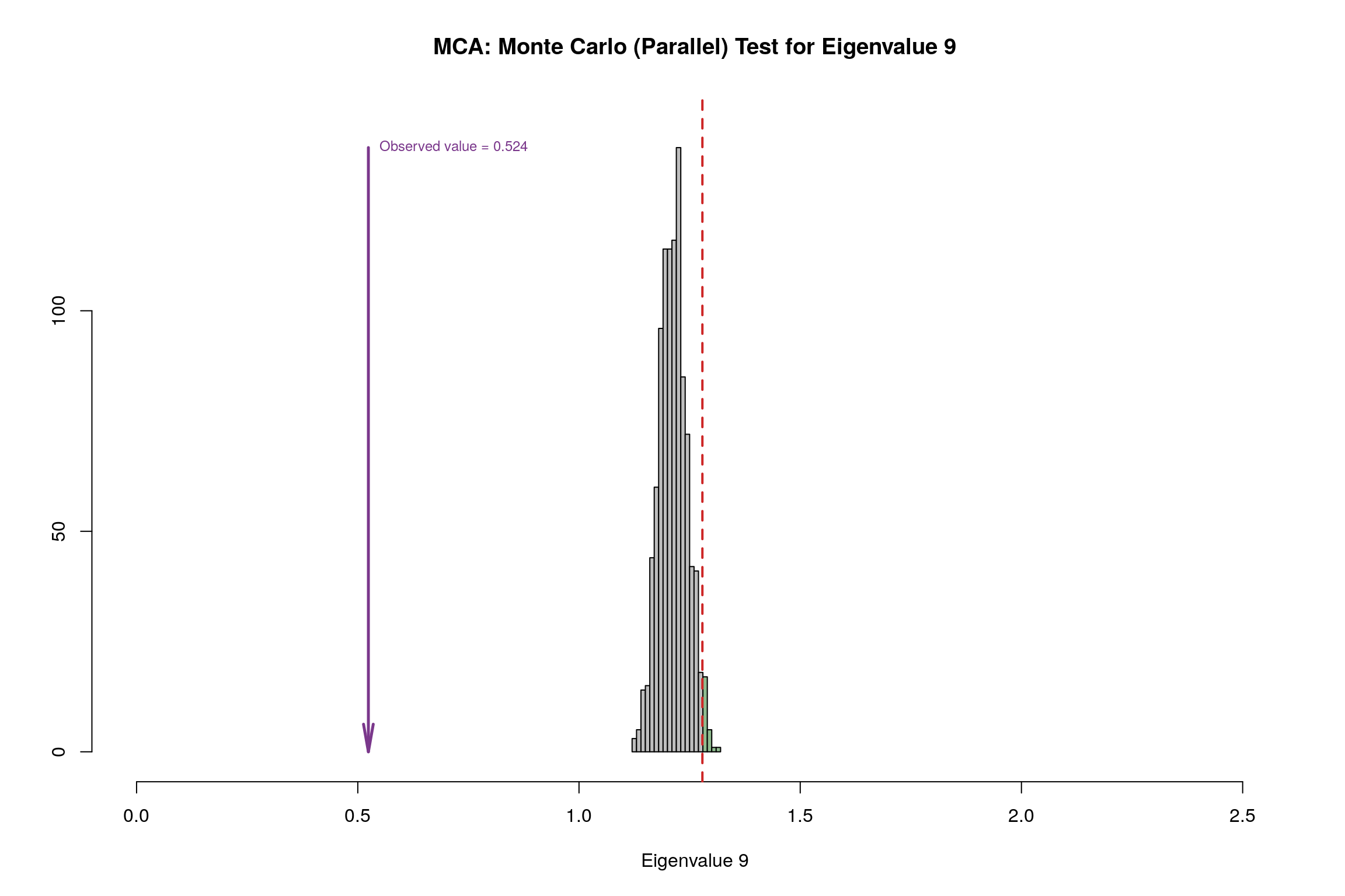
4.12 Parallet Test
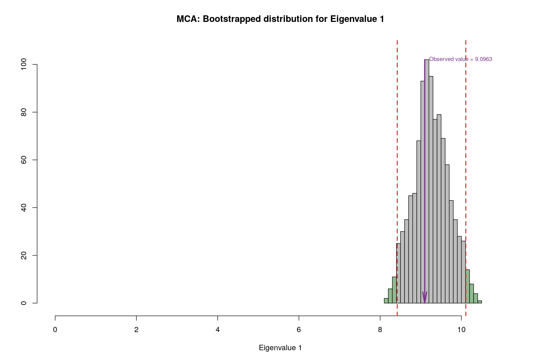
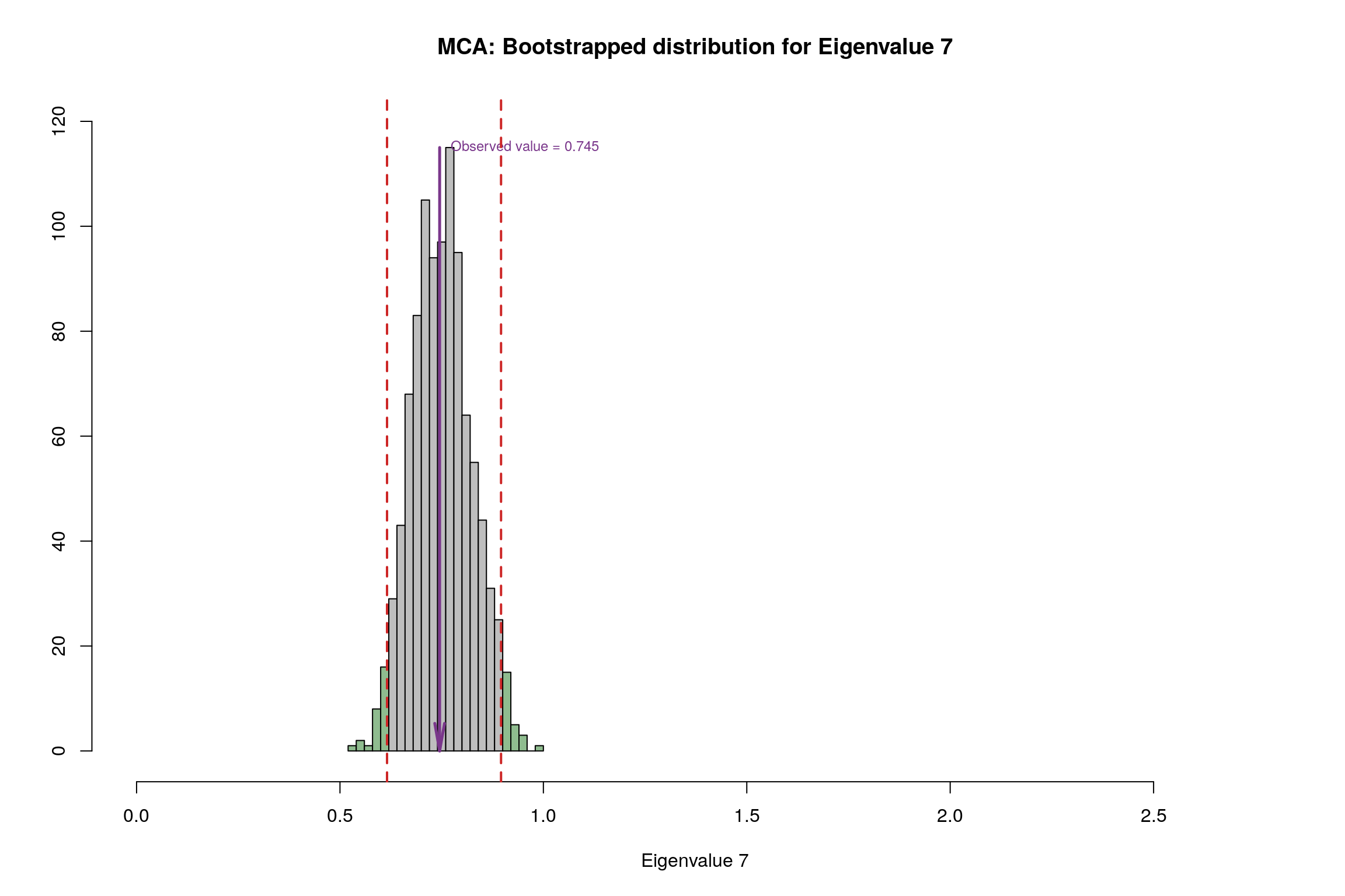
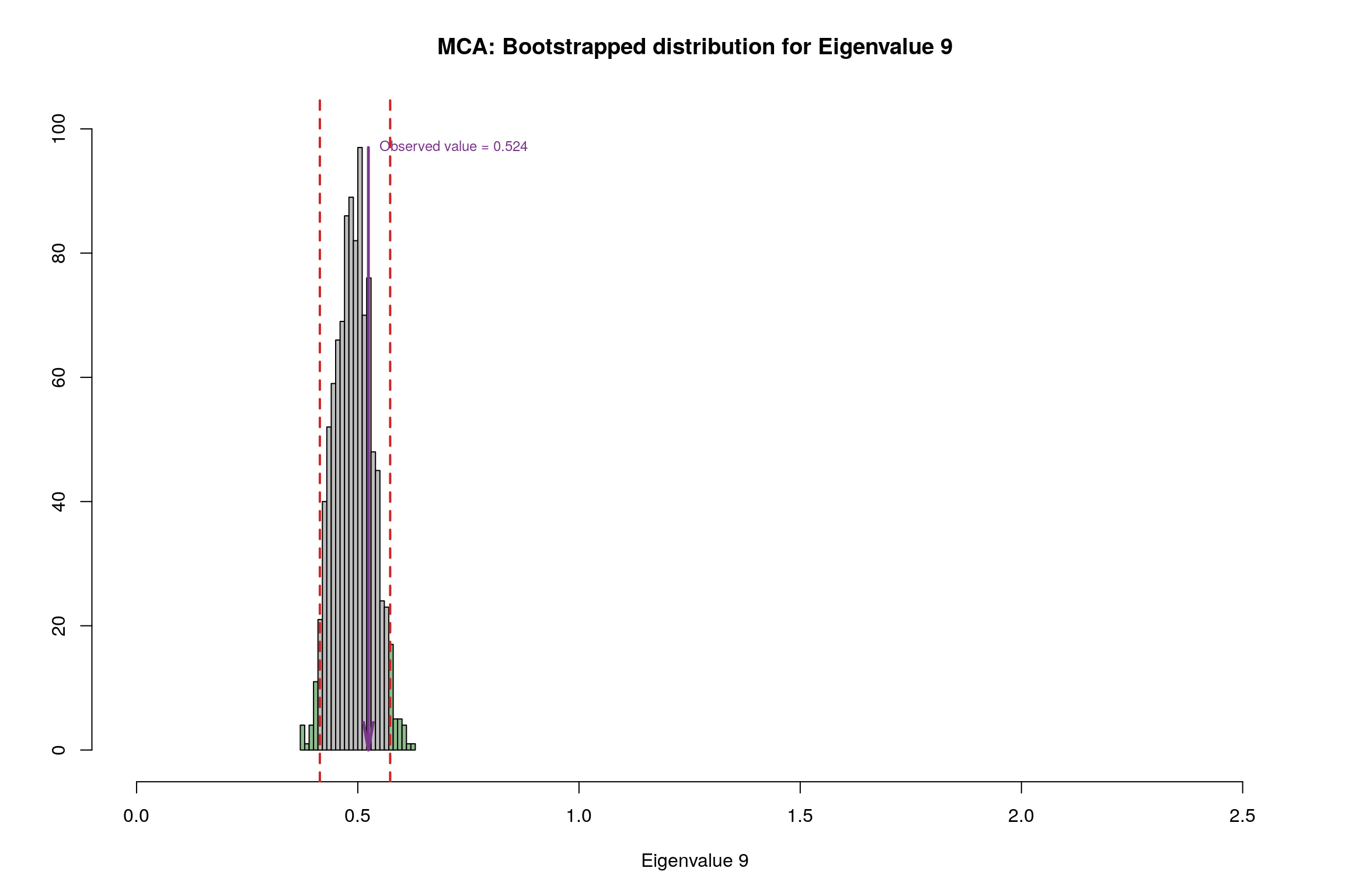
4.13 Bootstrap Test

4.14 Conclusion
| Methods | Unhappy | Normal | Very Happy | Reliability |
|---|---|---|---|---|
| MCA | warm summers, cold winters, high rain | N/A | Warm winter, cold summer, low rain | Components have significant contribution but convex hull has overlapping areas |