Chapter 3 Principal Component Analysis
3.1 Description
Principal component analysis (PCA), part of descriptive analytics, is used to analyze one table of quantitative data, specifically useful for high dimensional data and comparitively lesser data rows. PCA mixes the input variables to give new variables, called principal components. The first principal component is the line of best fit. It is the line that maximizes the inertia (similar to variance) of the cloud of data points. Subsequent components are defined as orthogonal to previous components, and maximize the remaining inertia.
PCA gives one map for the rows (called factor scores), and one map for the columns (called loadings). These 2 maps are related, because they both are described by the same components. However, these 2 maps project different kinds of information onto the components, and so they are interpreted differently. Factor scores are the coordinates of the row observations and Loadings describe the column variables. Both can be interpreted through their distance from origin. However, Factor scores are also interpreted by the distances between them and Loadings interpreted by the angle between them.
The distance from the origin is important in both maps, because squared distance from the mean is inertia (variance, information; see sum of squares as in ANOVA/regression). Because of the Pythagorean Theorem, the total information contributed by a data point (its squared distance to the origin) is also equal to the sum of its squared factor scores.
With both Factor and Loadings maps combined we can interpret which grouping criteria of rows of data is most impacted by which columns. This can interpreted visually by observing which a factors and loadings on a particular component and the distance on this component.
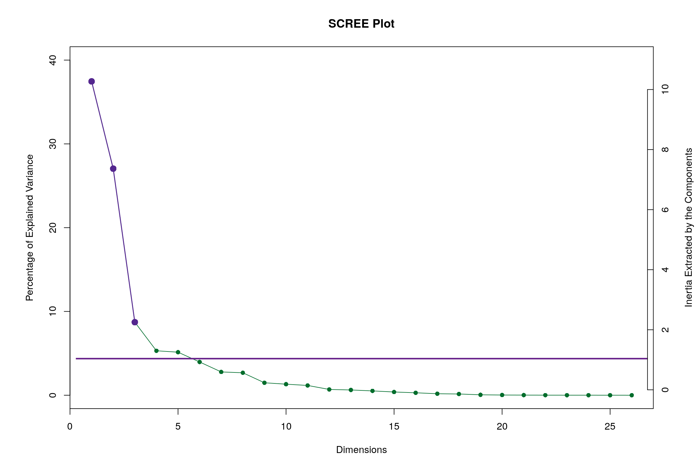
PCA also helps in dimensionality reduction. Using SVD, we get eigen values arranged in descending order in the diagonal matrix. We can simply ignore the lower eigen values to reduce dimensions. We can also take help of SCREE plot to visually analyze importance of eigen values.
There are multiple variables representing rain and Temp. Hence, for analysis purposes, lets choose annual mean for Rain and Temp.
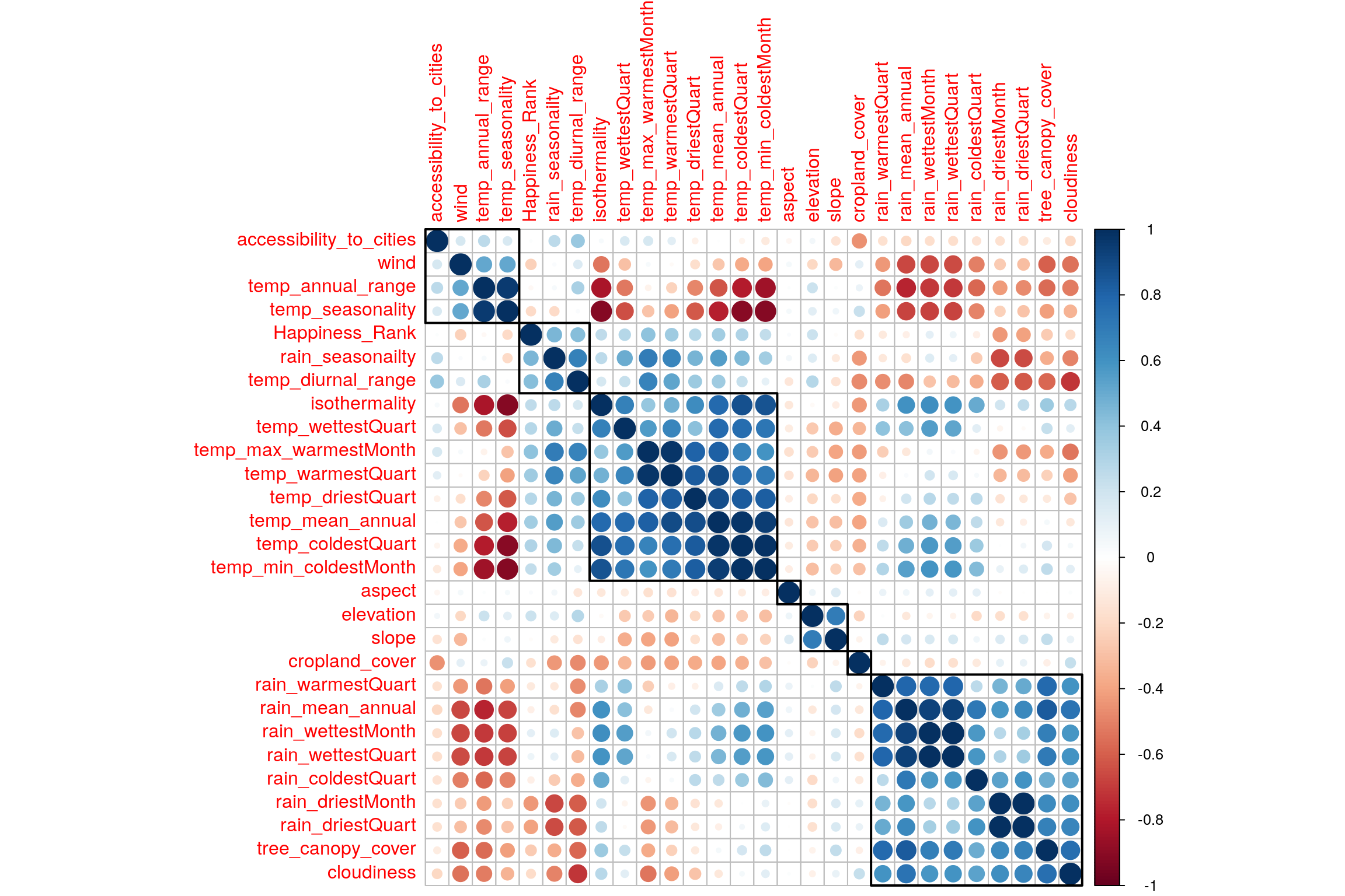
3.2 Correlation Plot
Visually analyze multicollinearity in the system.
Now we have Factor scores and Loadings. * Factor Scores are the new Data points w.r.t. new Components achieved with help of SVD. * Loadings represent correlation between variables w.r.t the choosen Components. Can be interpreted in 3 ways + As slices of inertia of the contribution data table w.r.t. the choosen Components + As correlation between columns (features) of Original Data and Factor scores of each Components (latent features). + As coefficients of optimal linear combination i.e. Right Sigular Vectors (Q matrix of SVD)
3.3 Scree Plot
Gives amount of information explained by corresponding component. Gives an intuition to decide which components best represent data in order to answer the research question.
P.S. The most contribution component may not always be most useful for a given research question.
3.4 Factor Scores
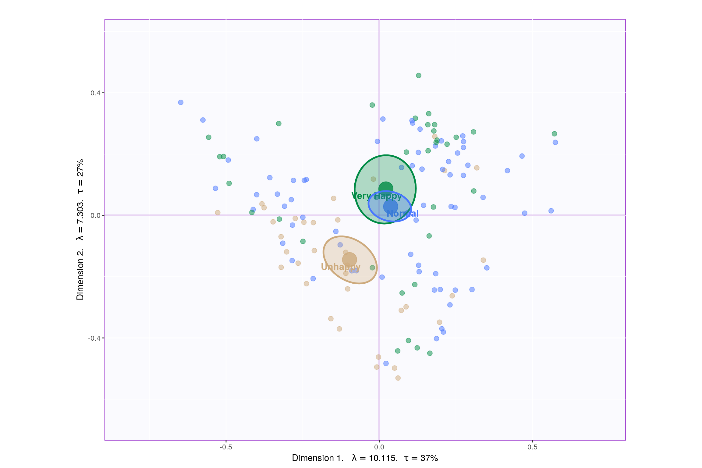
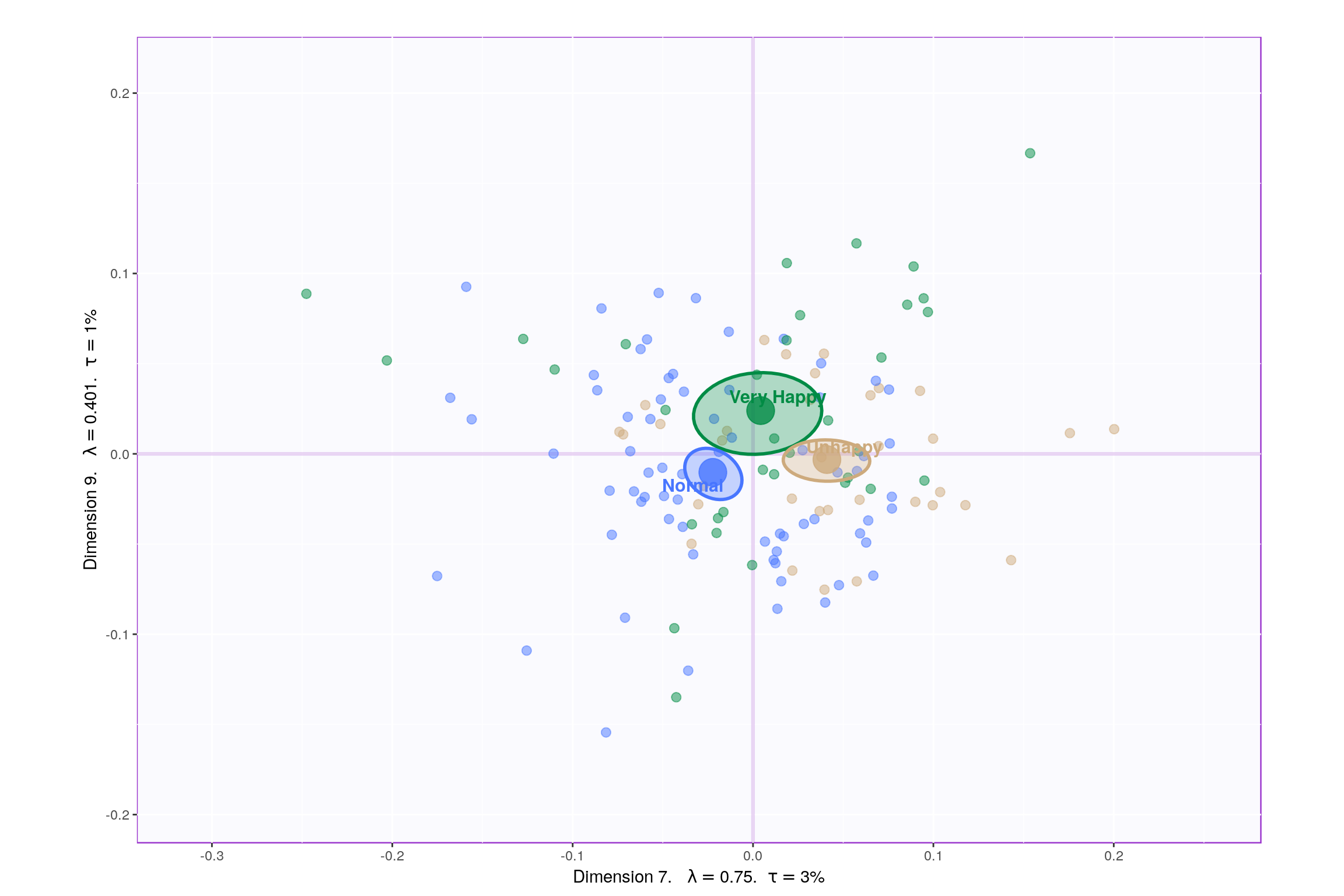
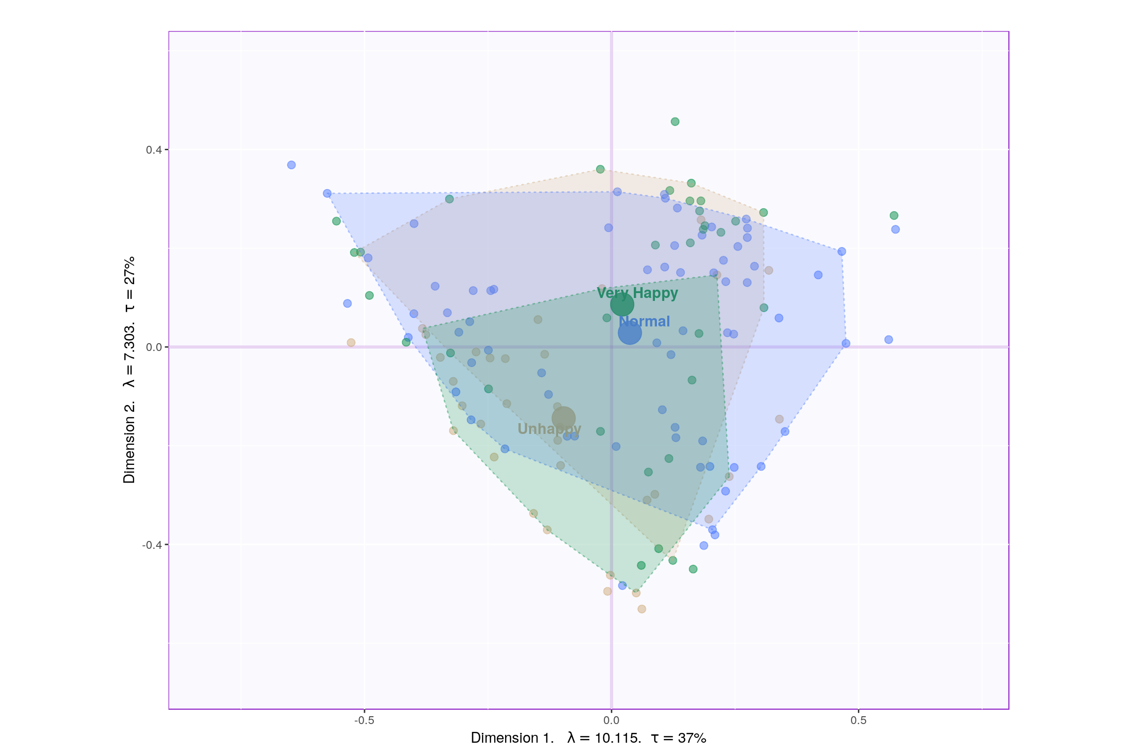
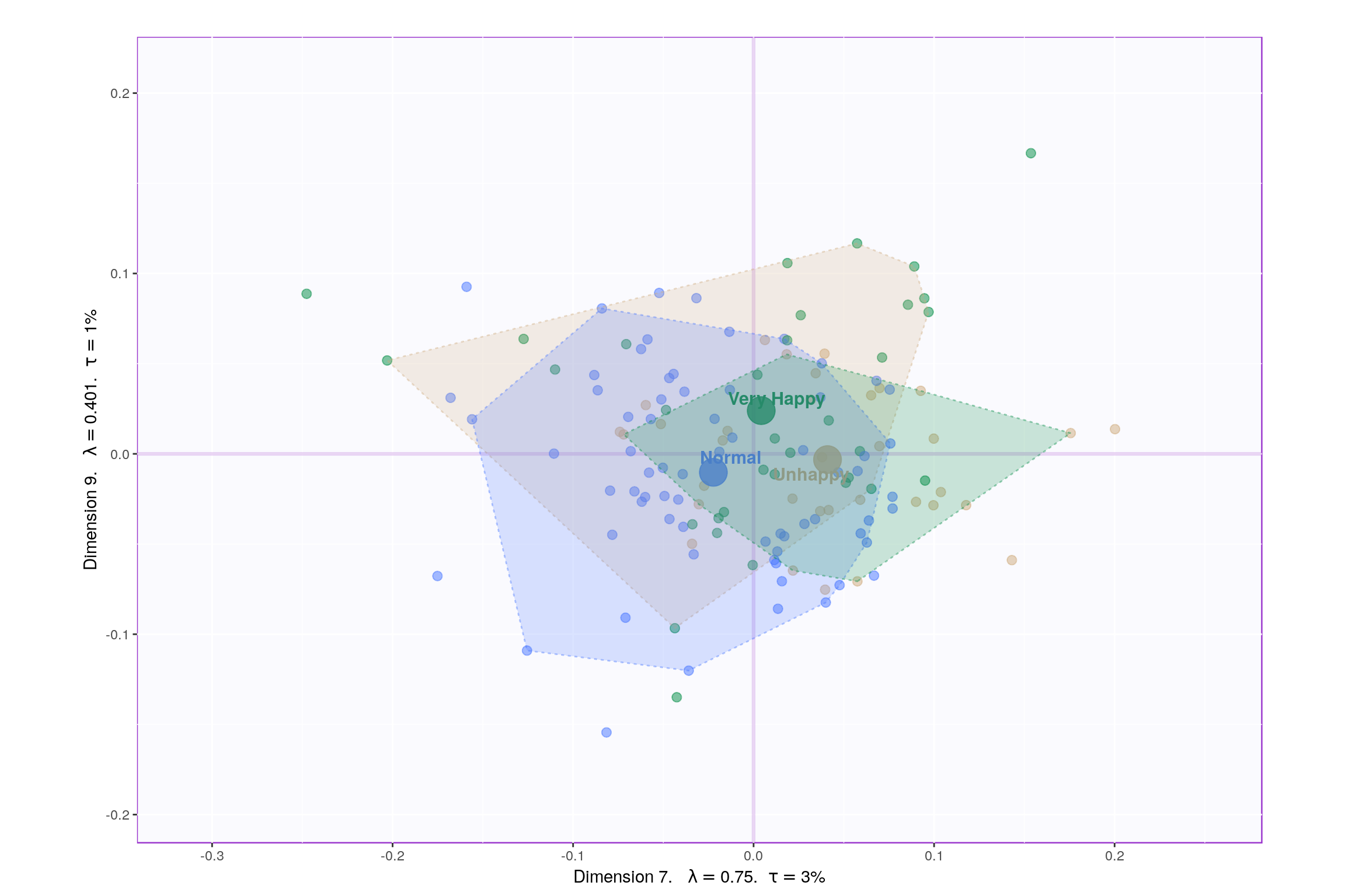
Lets visualize happiness categories for components 1-10, to make a decision (visually) on the most important components.
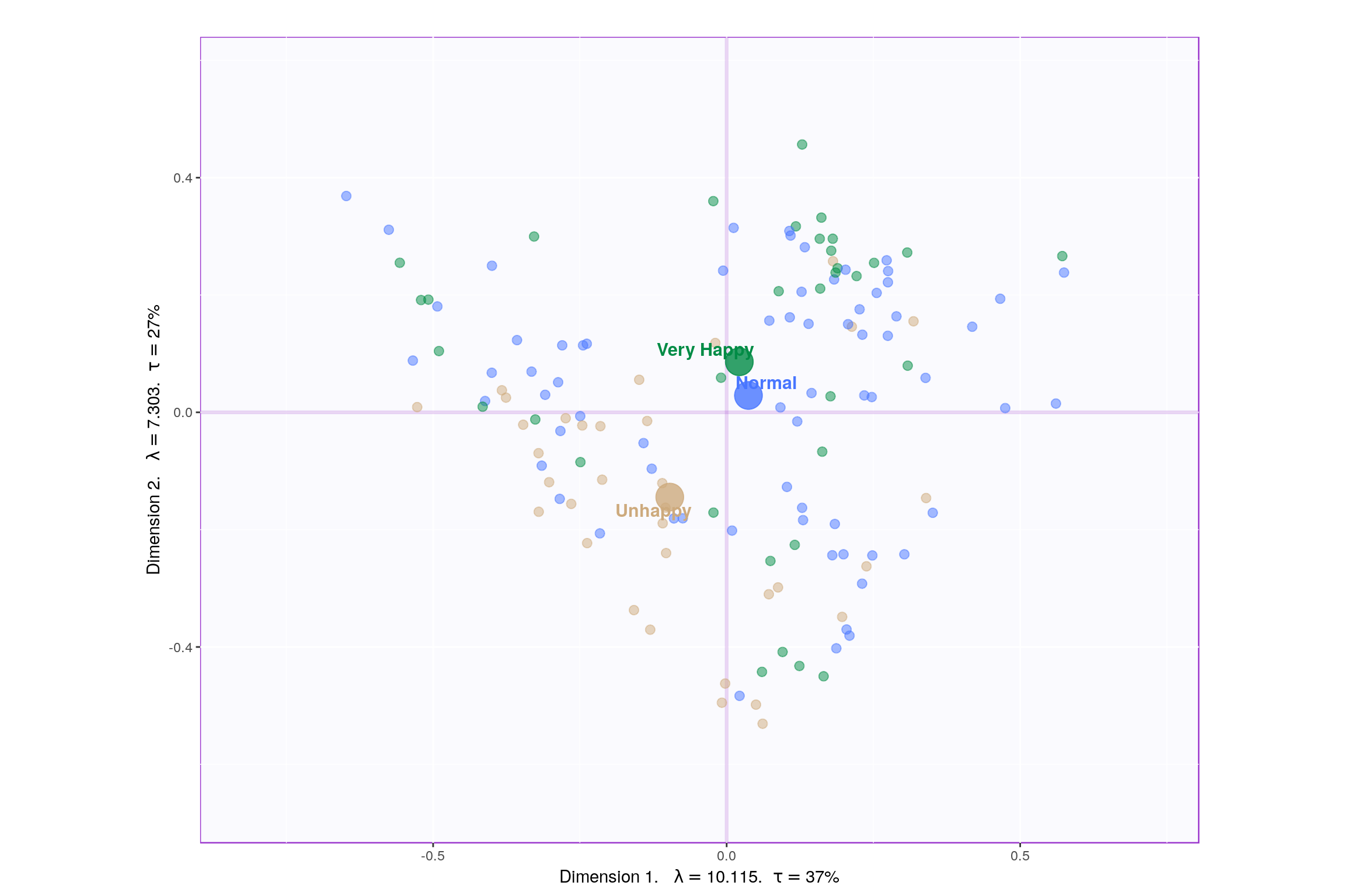
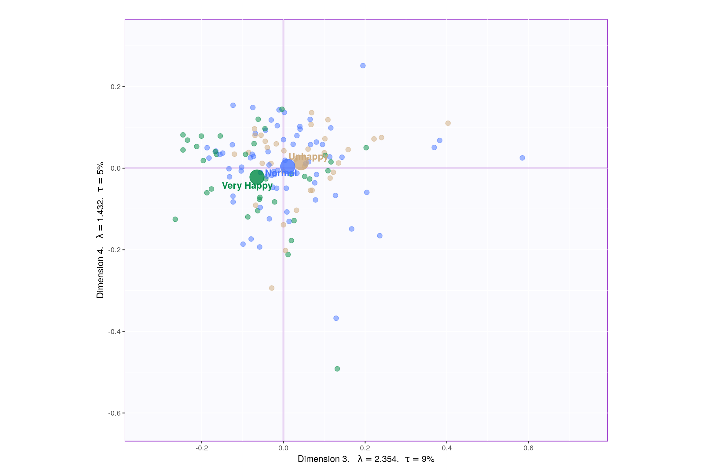
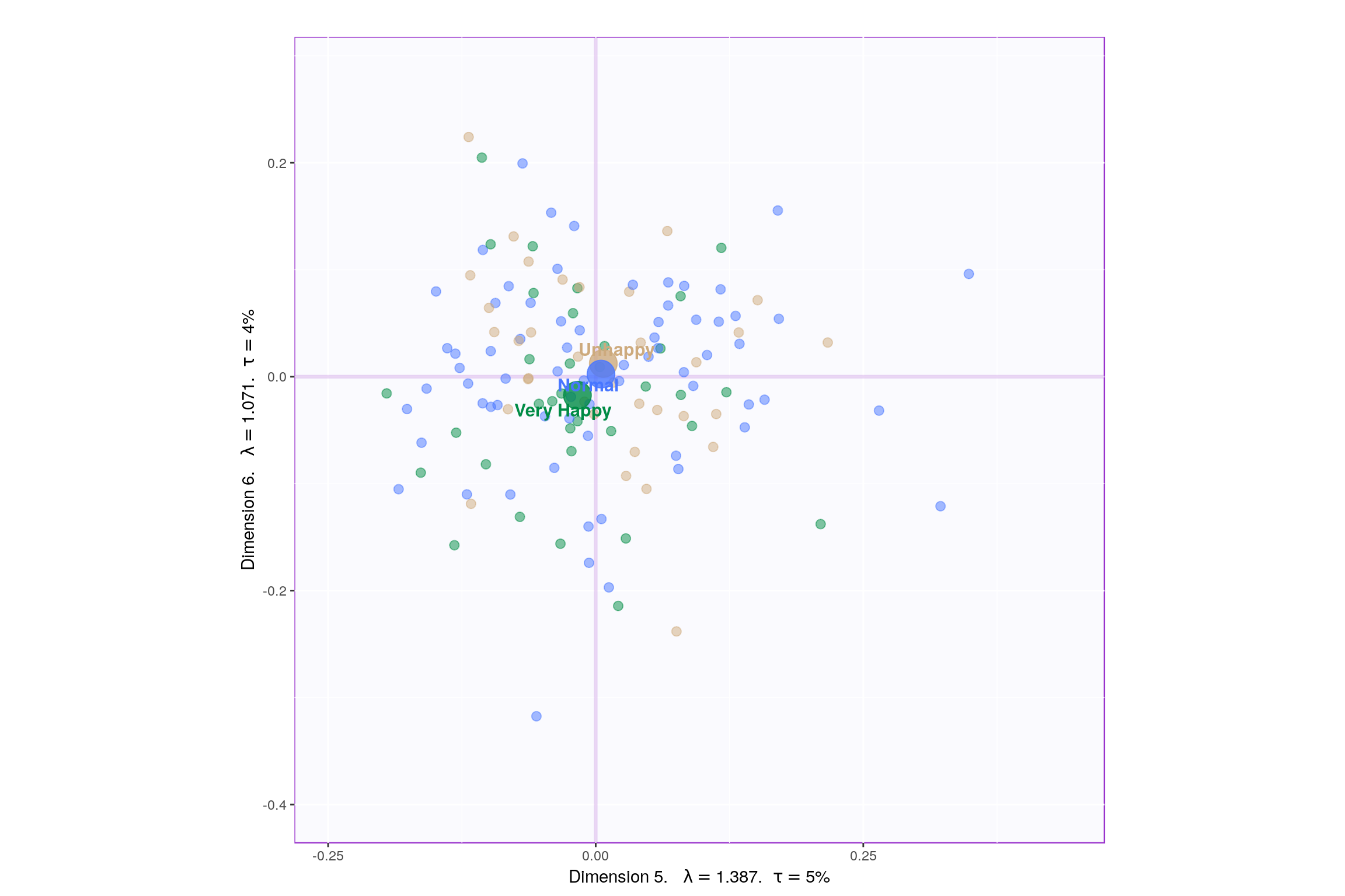
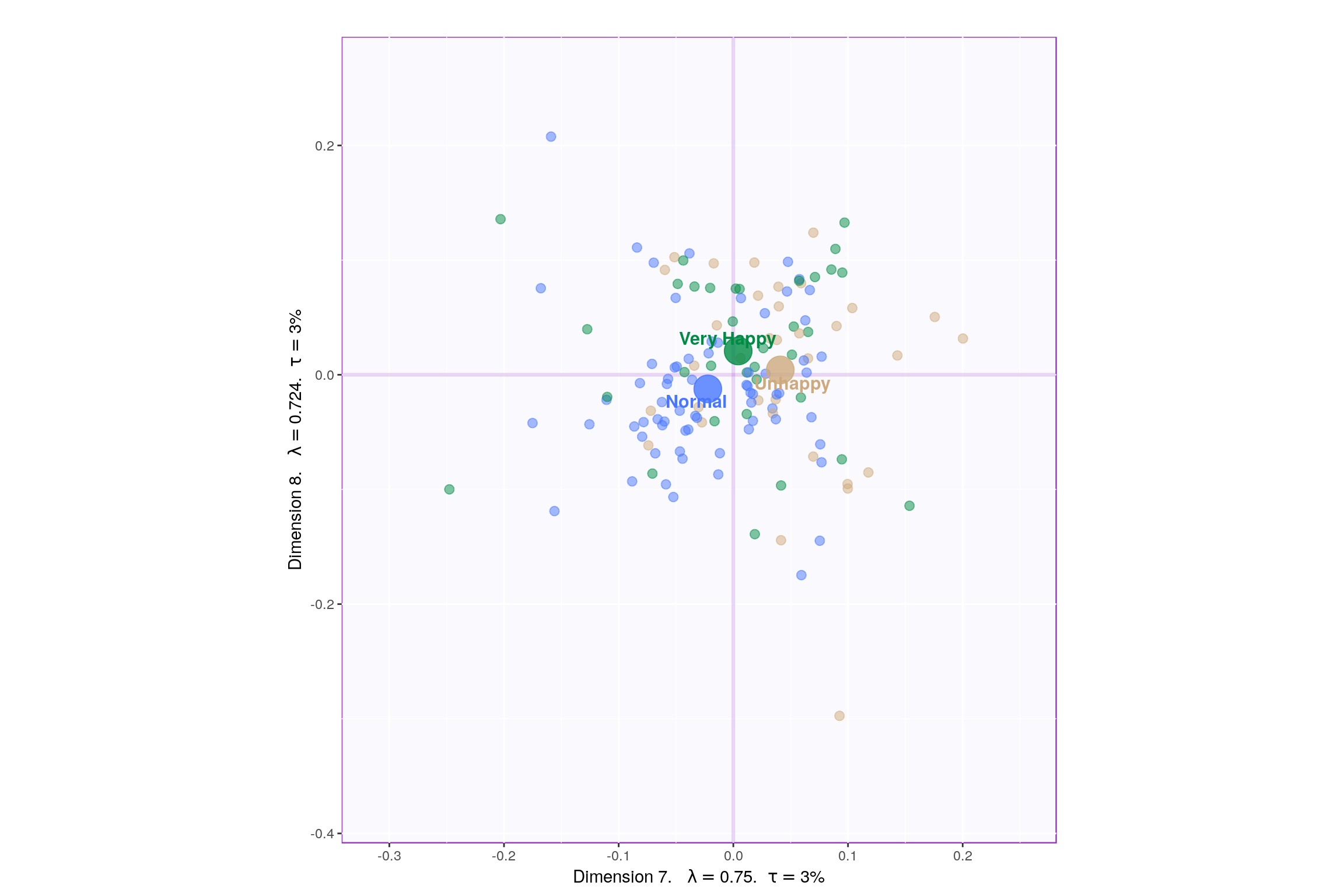
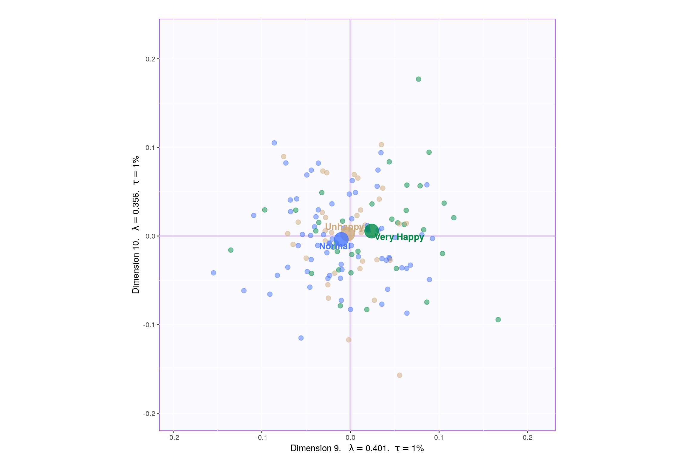
Since, it’s not very straightforward to decide which components may be best suited for the research question at hand, let’s represent, in a tabular format, which component helps to differentiate between which design variable values (Unhappy, Normal, Very Happy)
P.S. here -1 represents -ve quadrant of the component and +1 represent +ve quadrant. 0 represents that component was not decisive enough to clearly seperate happiness levels.
| Unhappy | Normal | VeryHappy | |
|---|---|---|---|
| Component 1 | -1 | 1 | 0 |
| Component 2 | -1 | 0 | 1 |
| Component 3 | 1 | 0 | -1 |
| Component 4 | 0 | 0 | 0 |
| Component 5 | 0 | 0 | 0 |
| Component 6 | 0 | 0 | 0 |
| Component 7 | 1 | -1 | 0 |
| Component 8 | 0 | 0 | 0 |
| Component 9 | 0 | -1 | 1 |
| Component 10 | 0 | 0 | 0 |
Looking at the table, it seems component 1, 2, 7, 9 may be able to best represent all 3 happiness levels. Although, SCREE Plot suggests that \(3^{rd}\) and \(4^{th}\) components might be useful, from our above analysis we know otherwise. Also, SCREE plot suggests that component \(6^{th}\) and onwards might not be useful which is contradicting our findings above. Hence, let’s plot components 1 vs 2 and 7 vs 9. Similarily, we will also plot Loading plots for these componenets.
- With Confidence Interval
- With Tolerance Interval
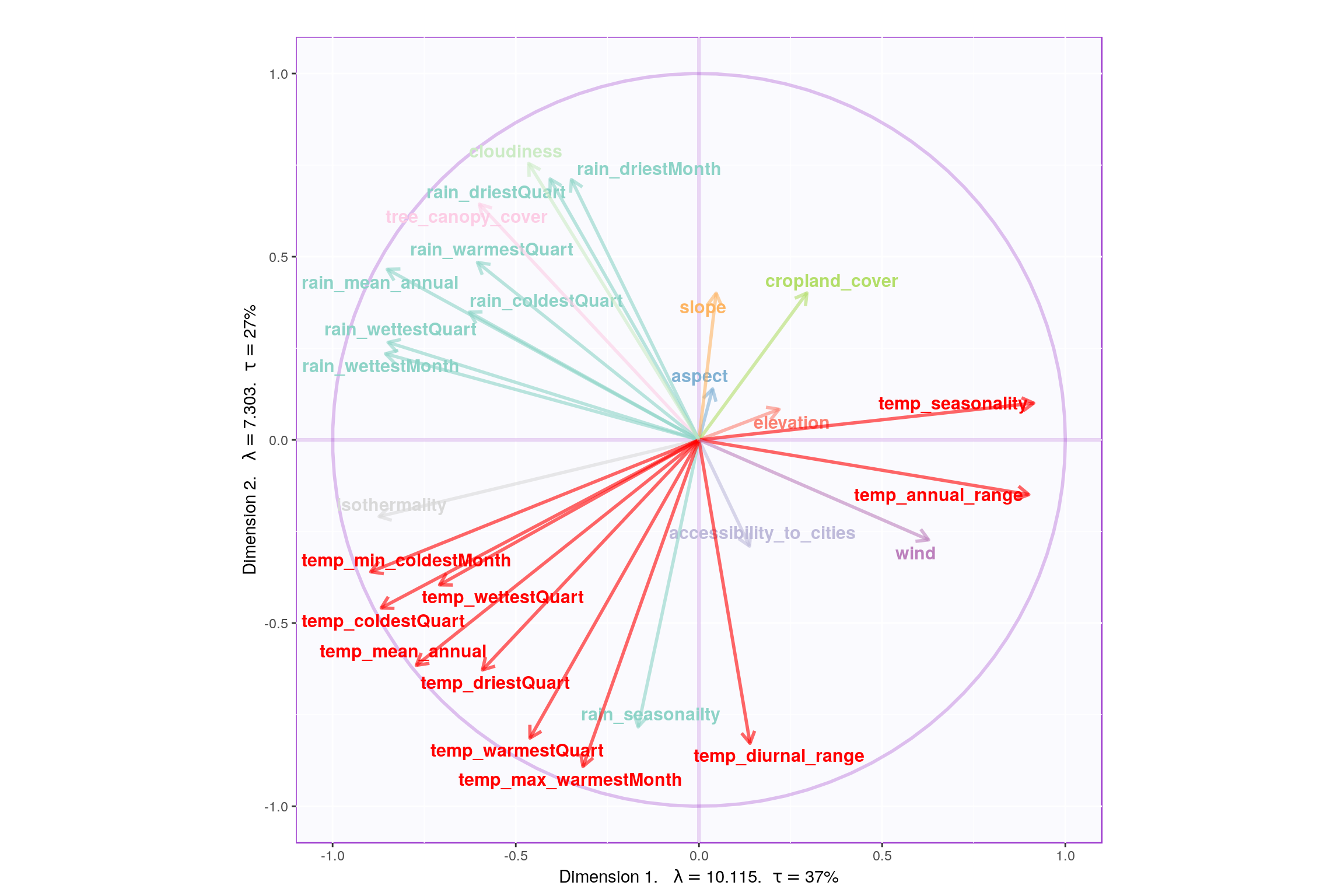
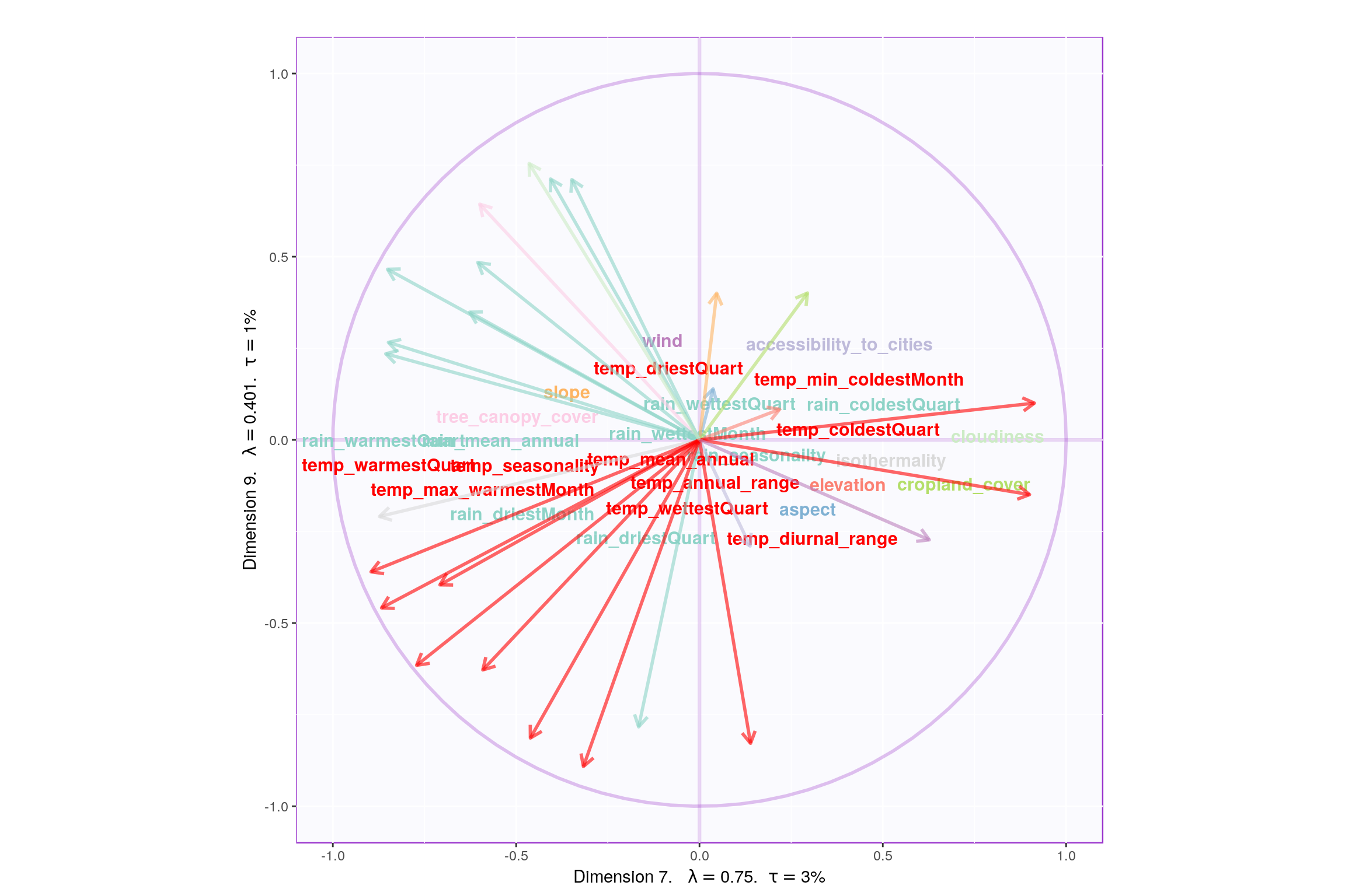
3.5 Loadings
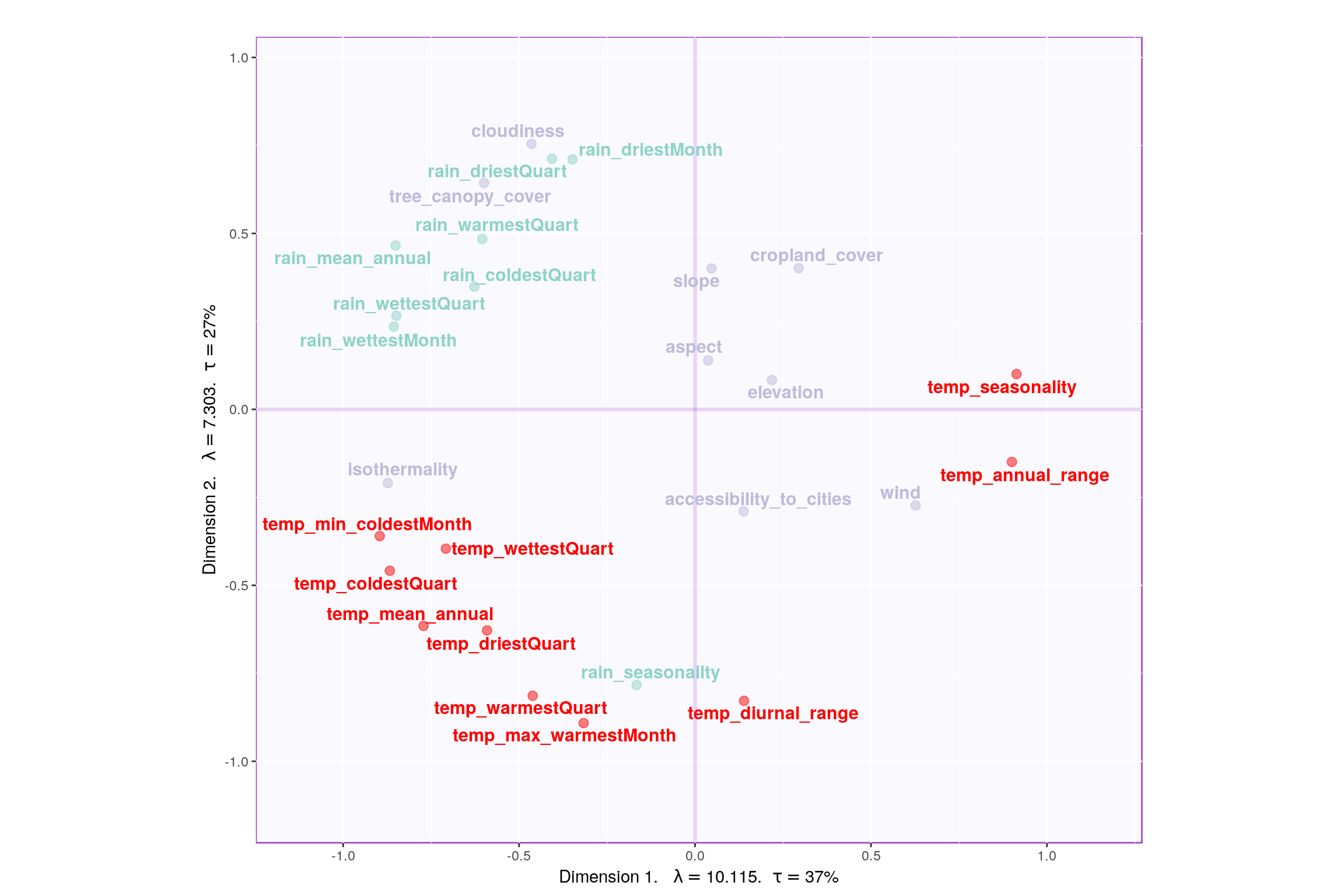
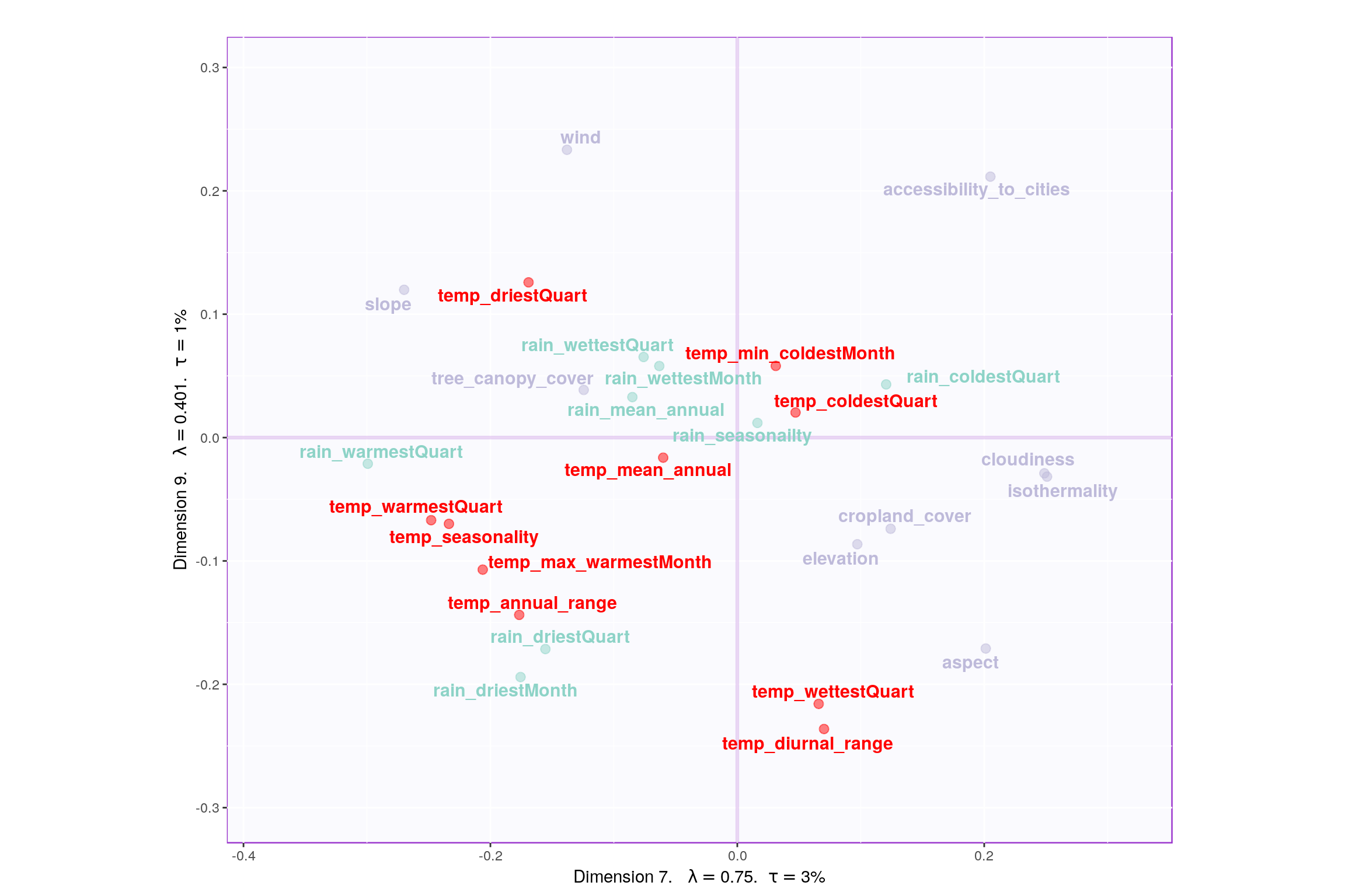
3.6 Correlation Circle
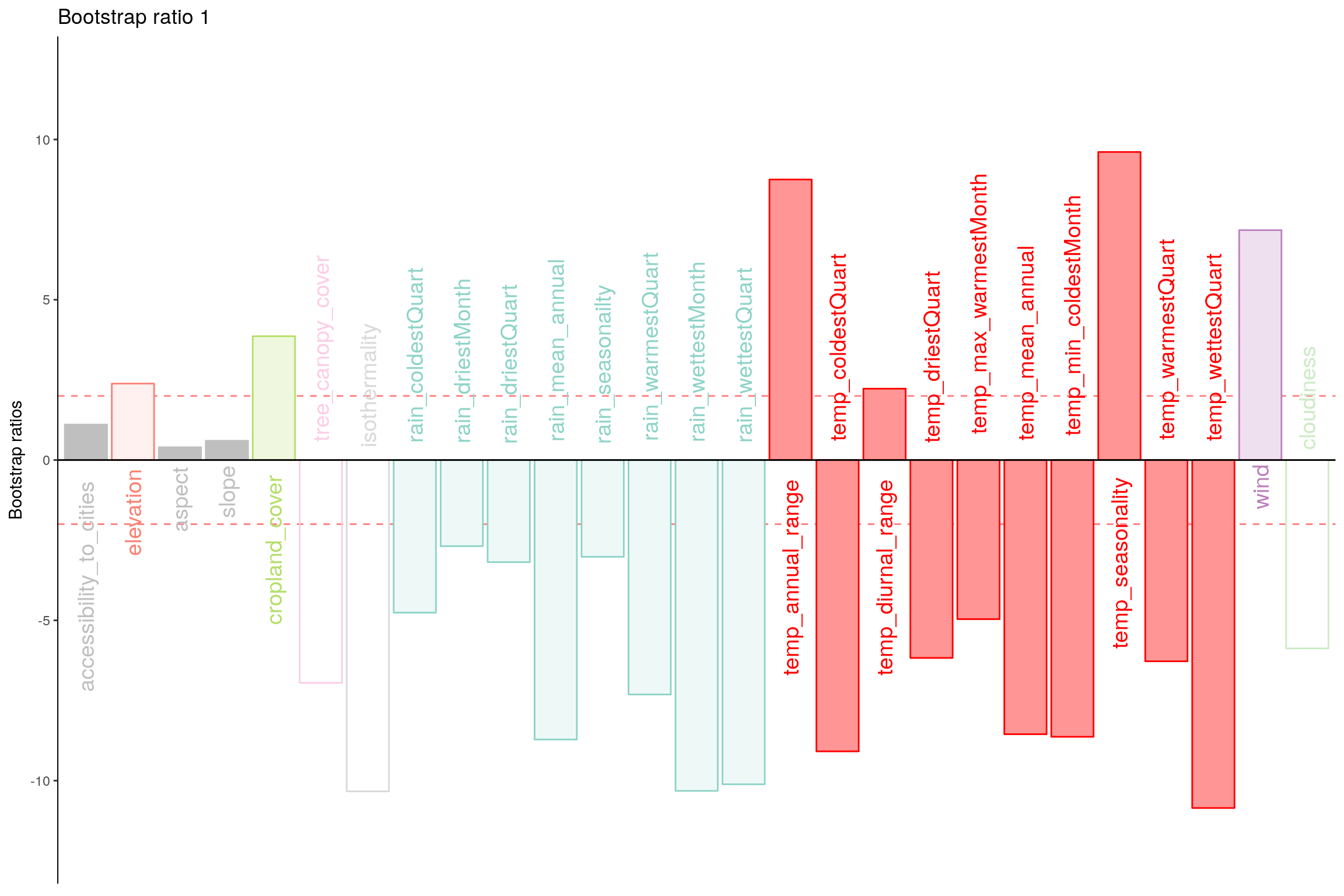
3.7 Most Contributing Variables
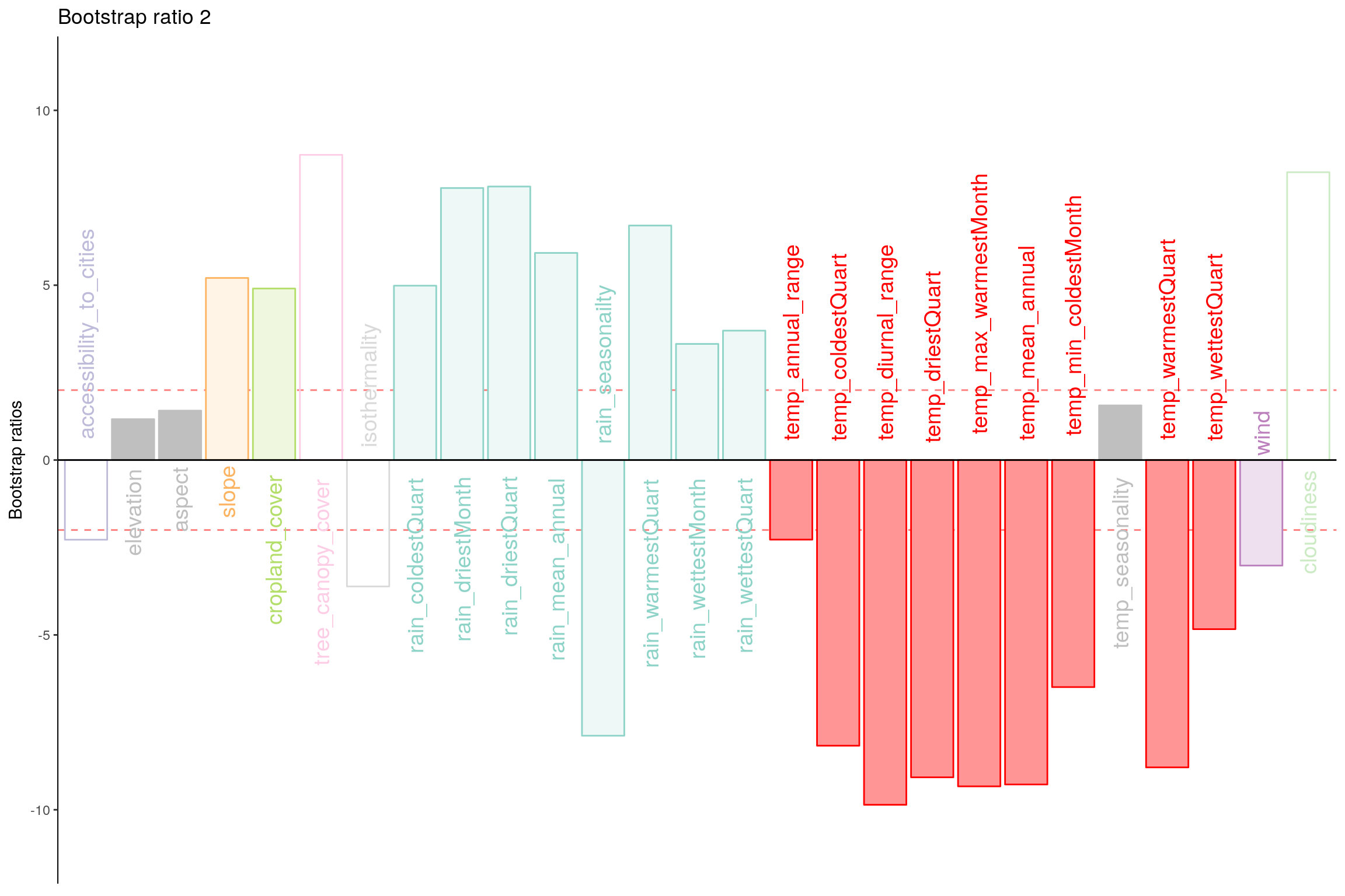
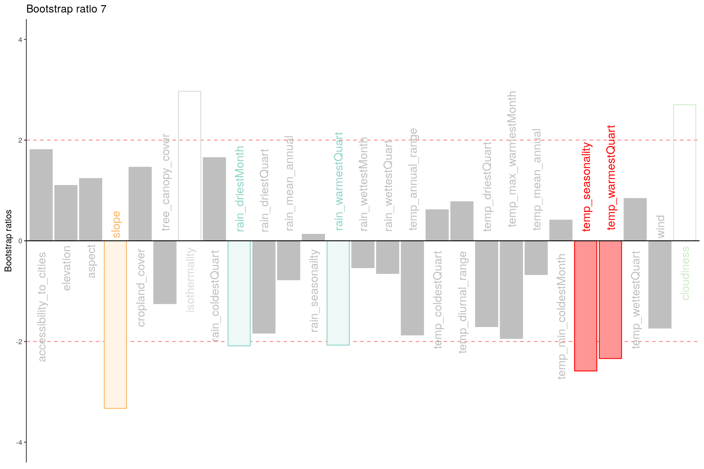
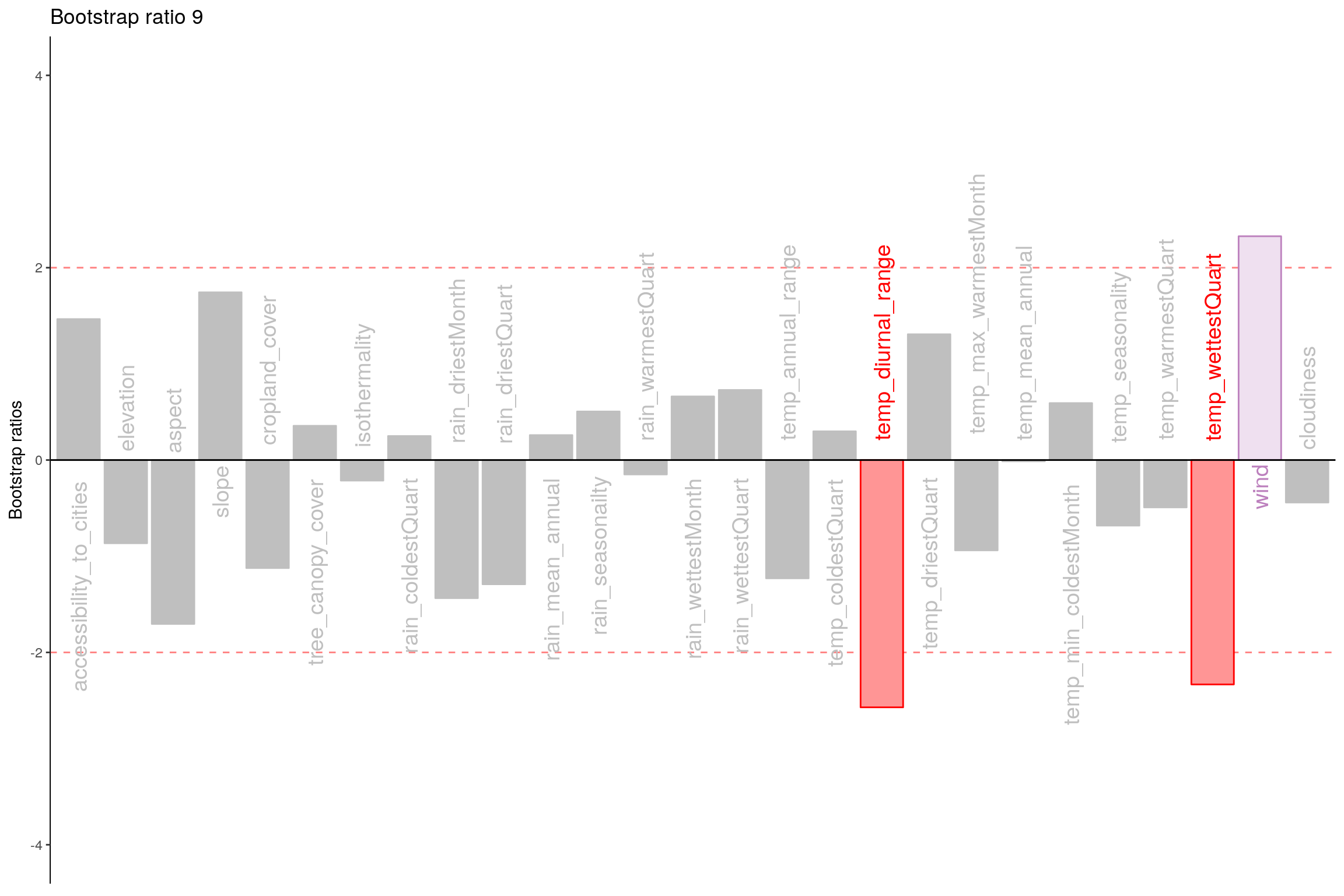
Let’s plot variable contributions against each chosen components i.e. 1, 7, 9.
- With Bootstrap Ratio
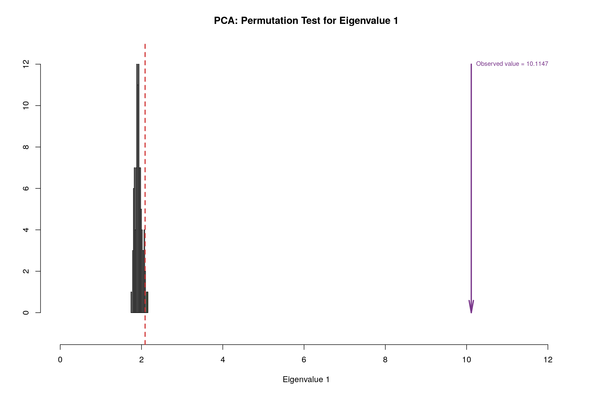
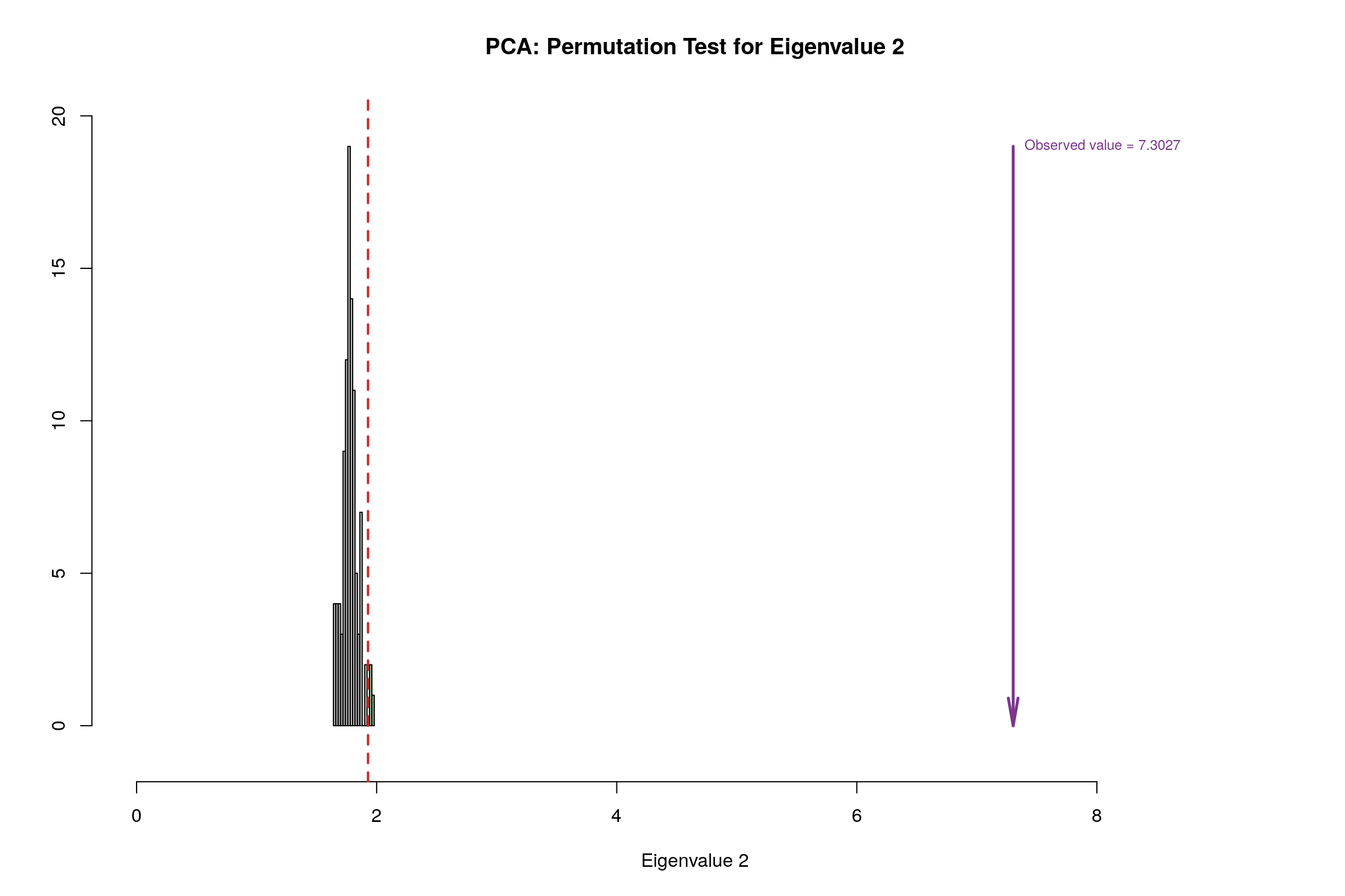
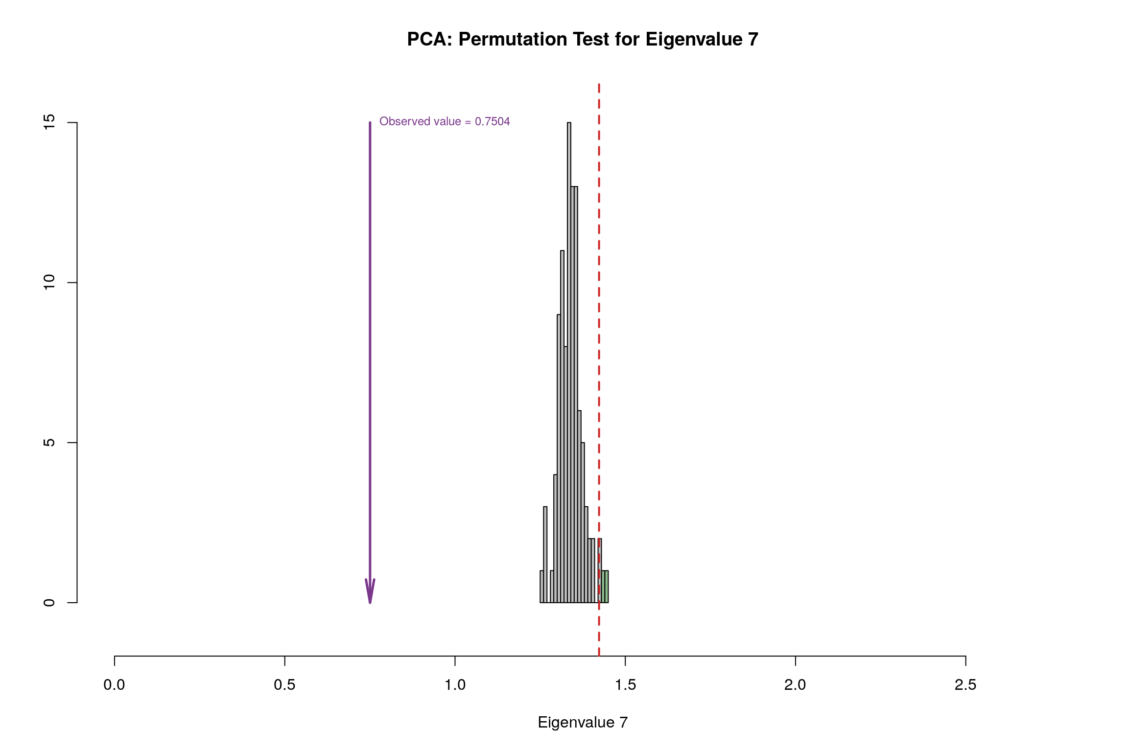
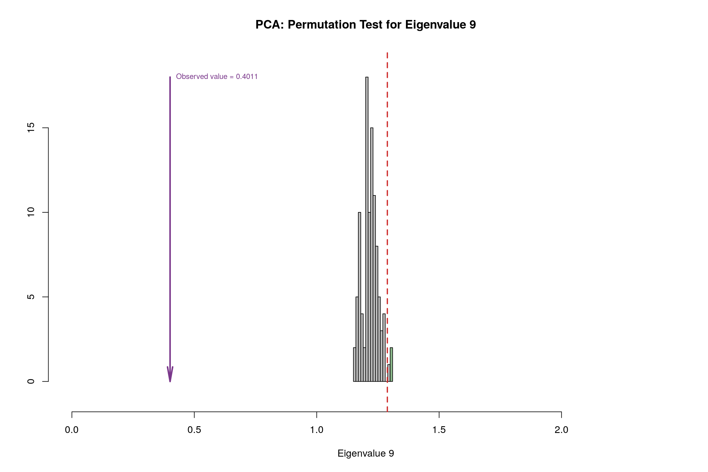
3.8 Permutation Test
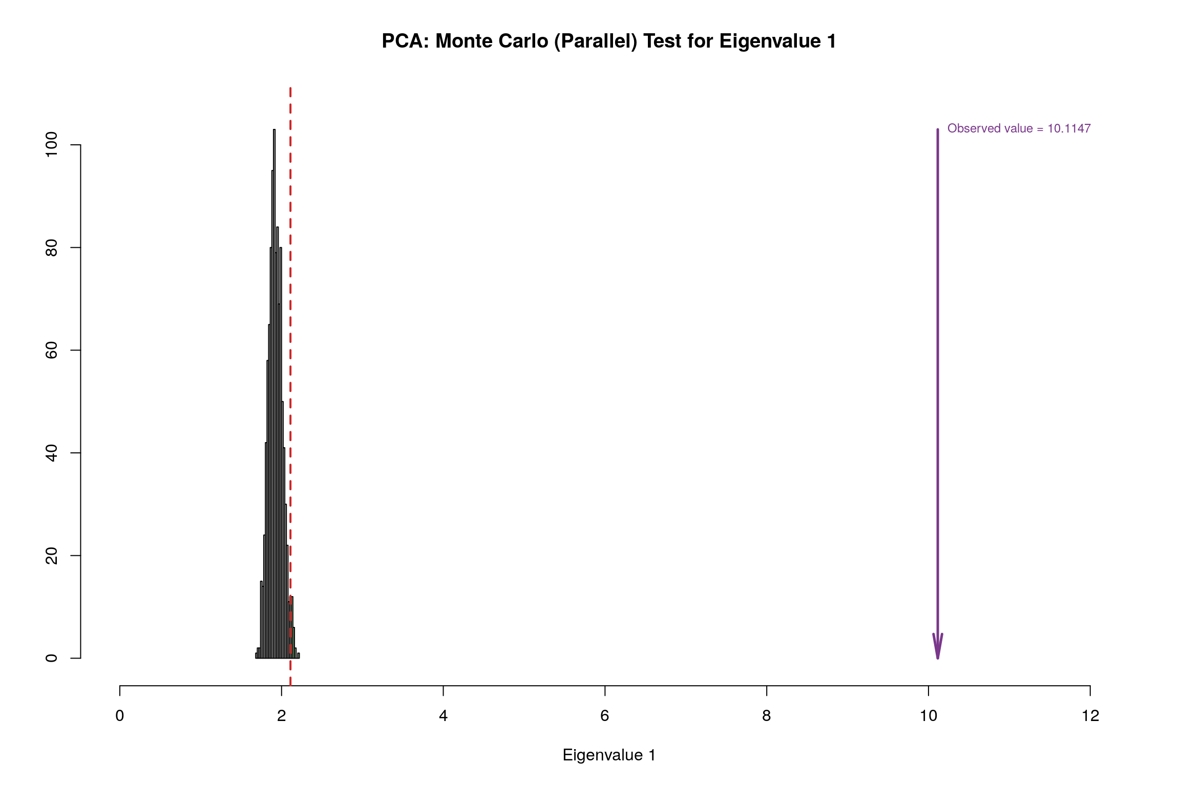
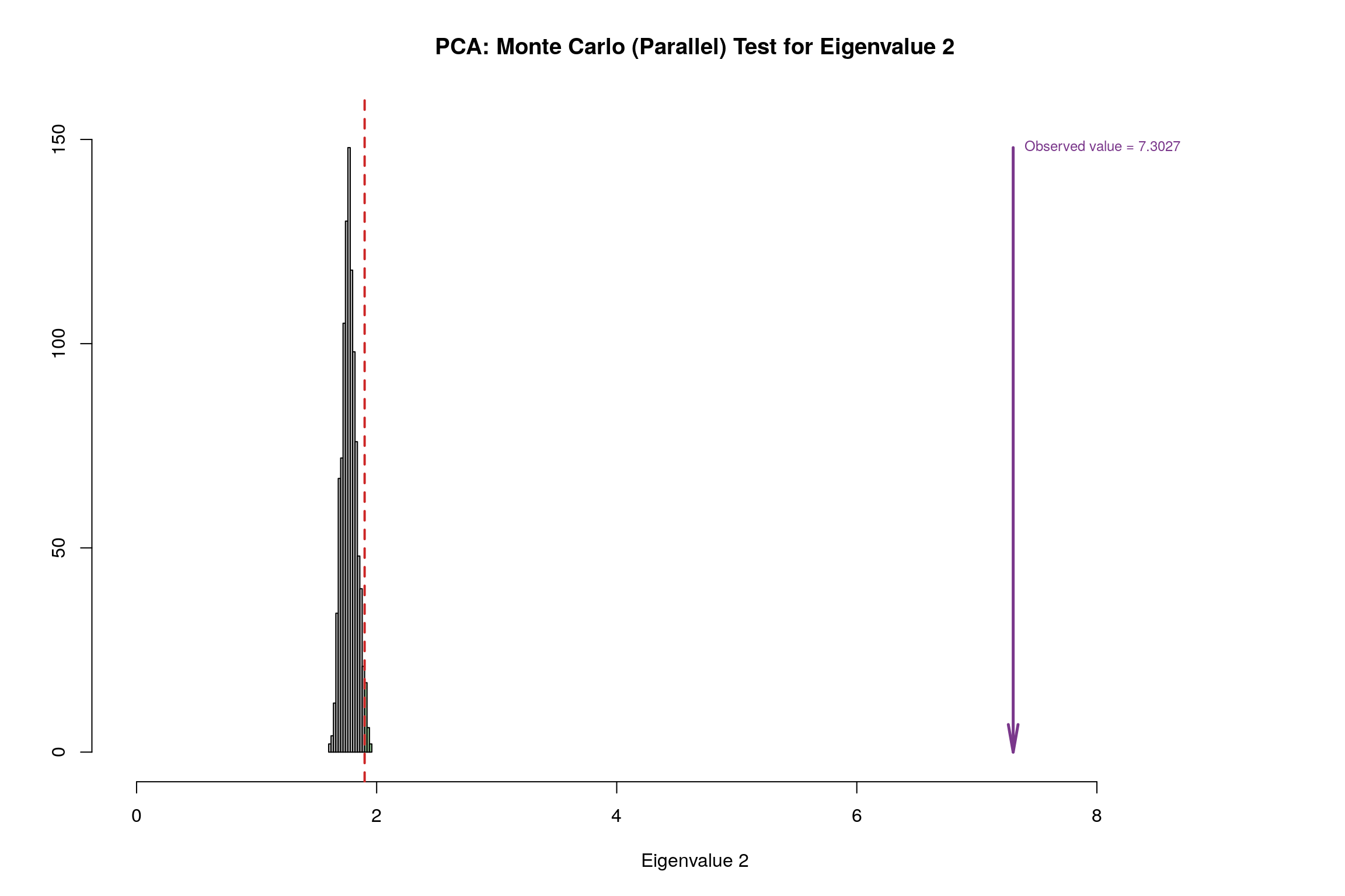
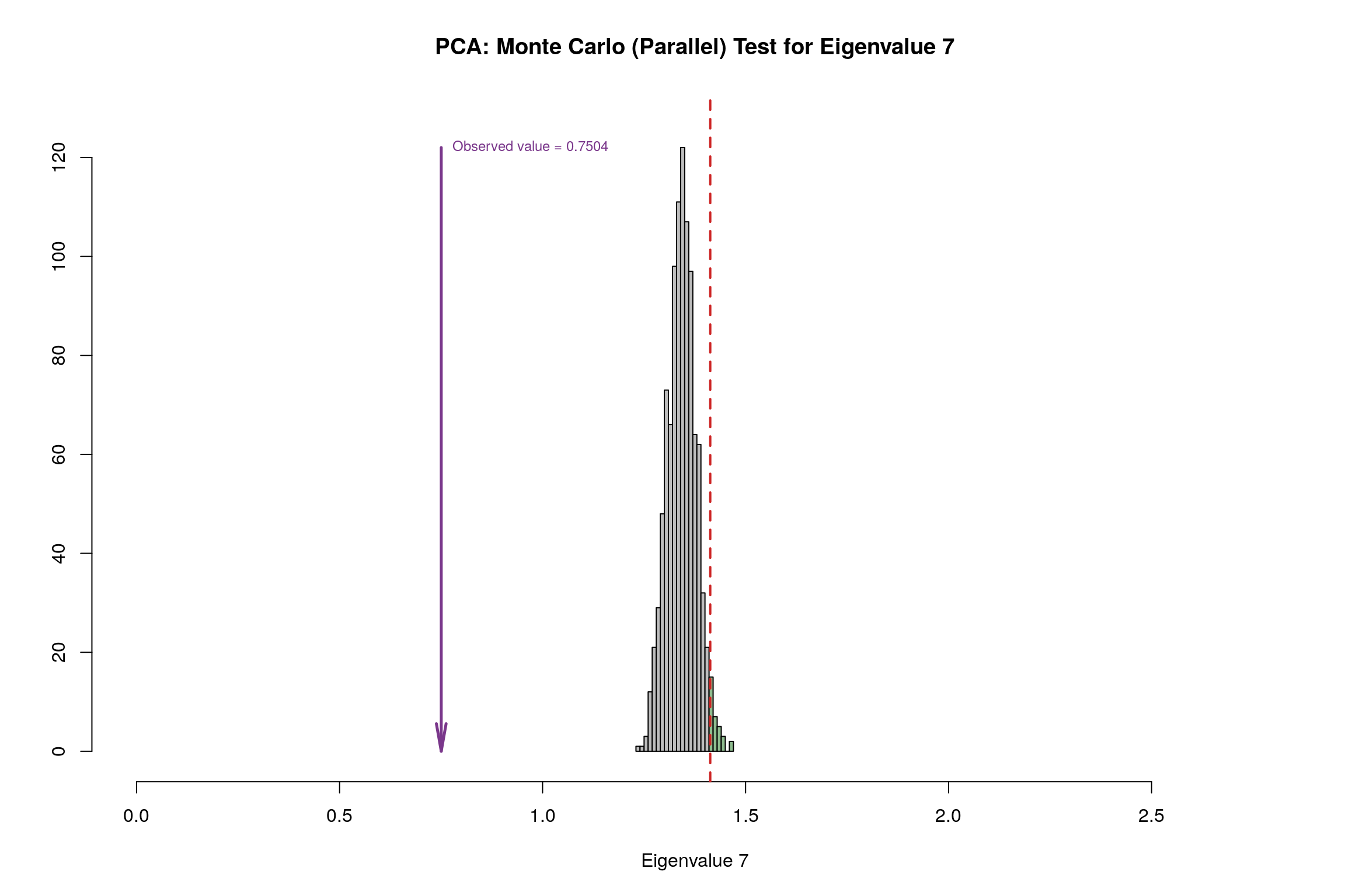
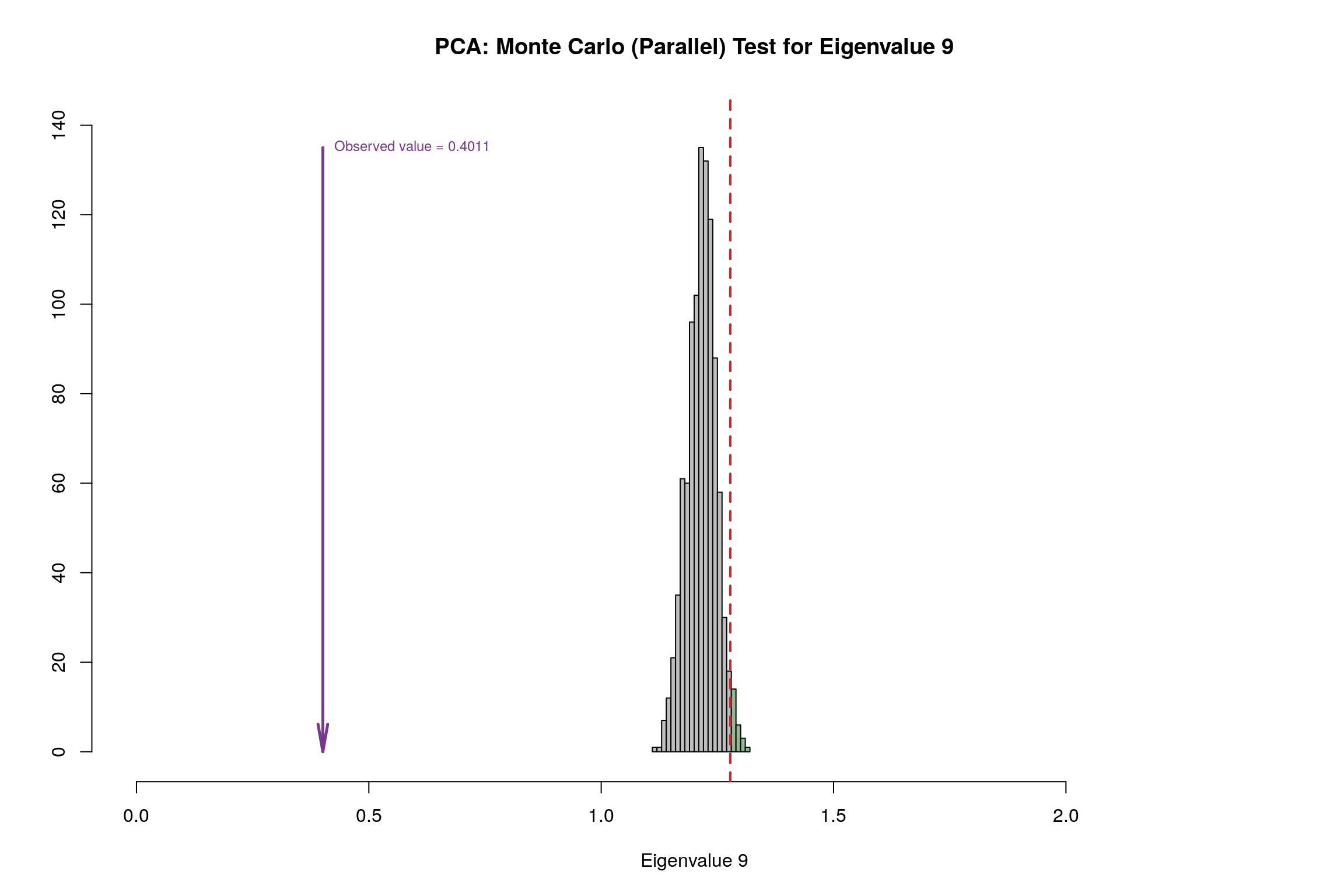
3.9 Parallet Test
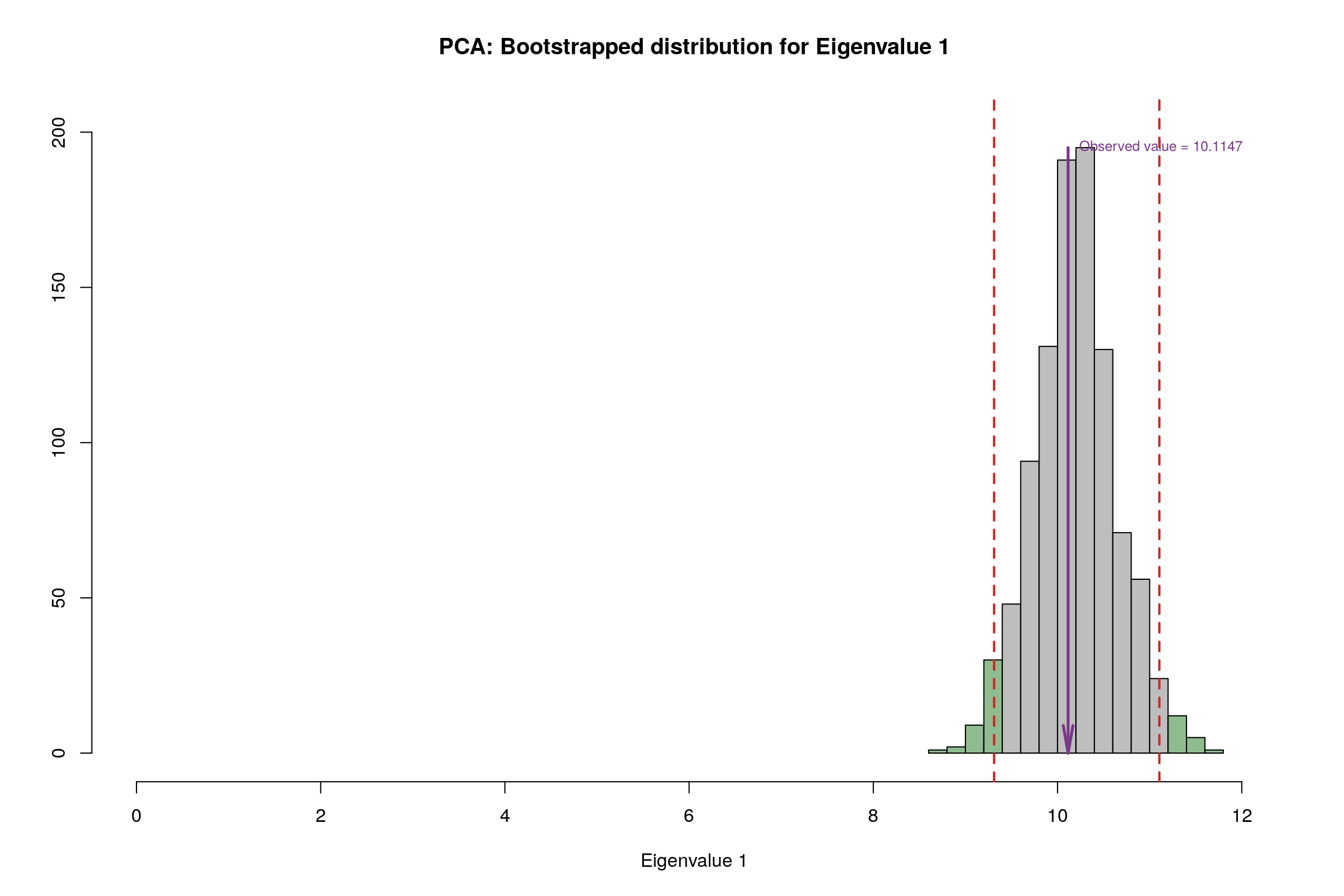
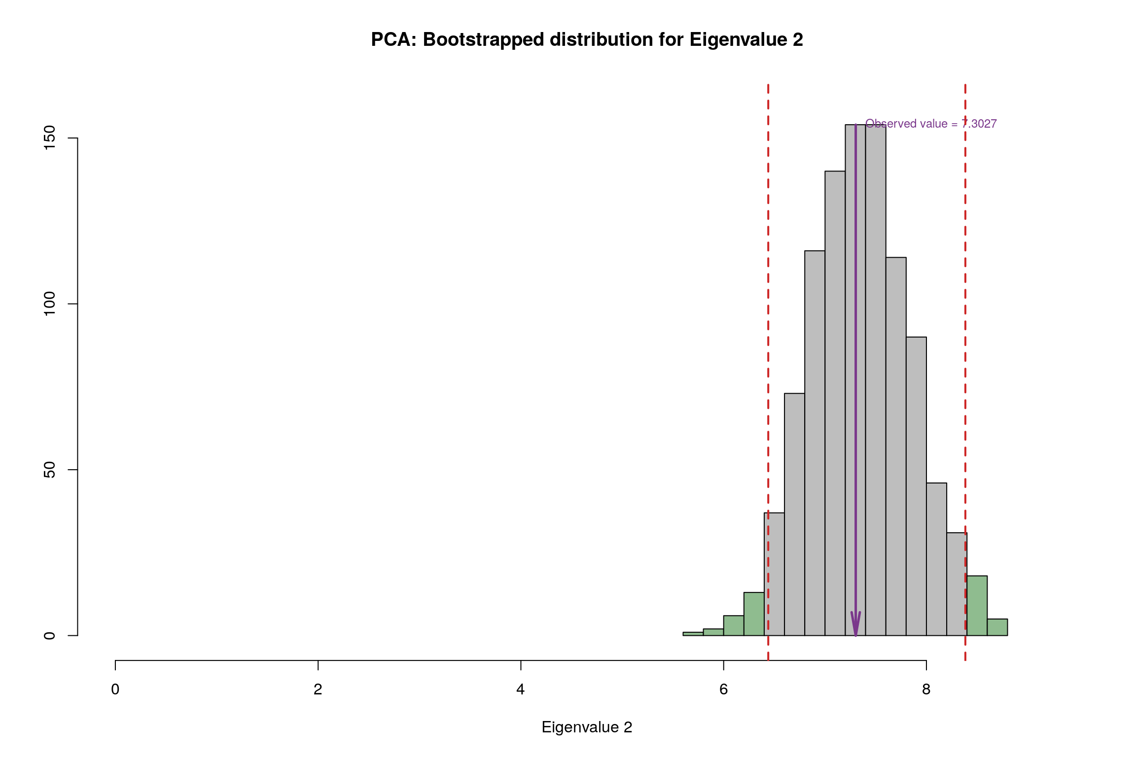
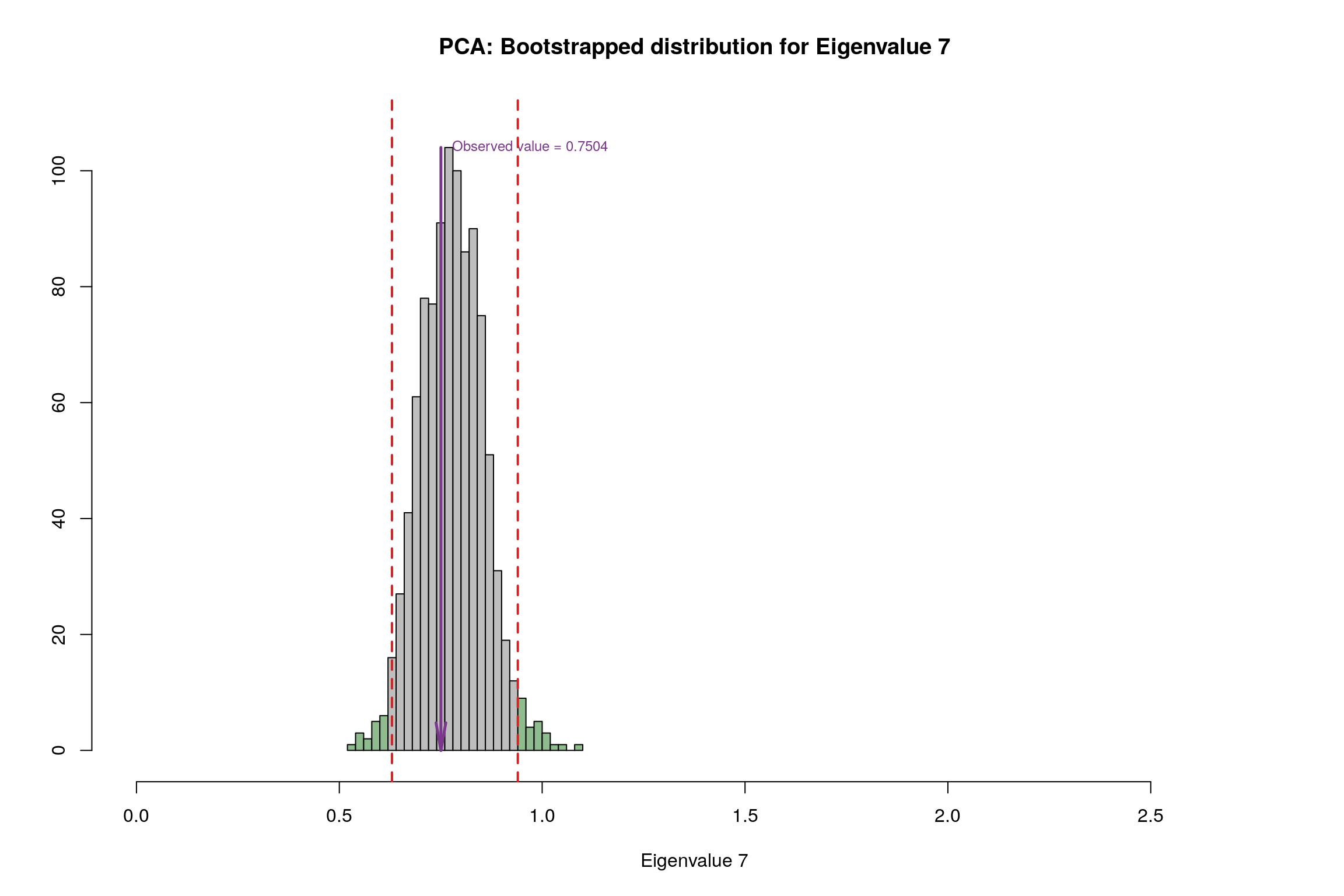
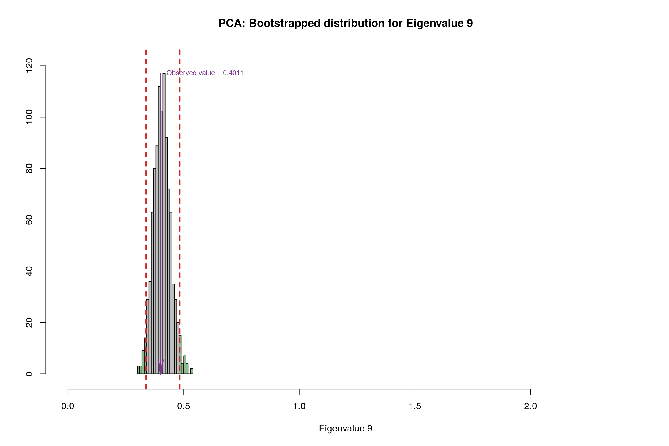
3.10 Bootstrap Test
3.11 Conclusion
- Component 1:
- Rows: Normal & Happy
- Columns: Cloudiness & Rain vs Cropland, Aspect, Elevation
- Interpret: People in countries with more Cloudiness, Trees and Rain tends to be happier.
- Component 7:
- Rows: Happy & Unhappy
- Columns: Temp and Rain vs Accessibility and Cropland
- Interpret: Rain and Temp seems to be main reason for unhappiness and Cropland is important for Happiness.
- Component 9:
- Rows: Happy & Very Happy
- Columns: Temp vs Rain
- Interpret: Rain and Temp seems to be main reason for Happiness. This contradicts with Component 7 and 1.