Chapter 11 Correspondence Analysis
11.1 Description
Correspondence Analysis (CA) is a multivariate graphical technique designed to explore relationships among categorical variables. The outcome from correspondence analysis is a graphical display of the rows and columns of a contingency table that is designed to permit visualization of the salient relationships among the variable responses in a low-dimensional space. Such a representation reveals a more global picture of the relationships among row-column pairs which would otherwise not be detected through a pairwise analysis.
Calculate CA:
- Step 1: Compute row and column averages
- Step 2: Compute the expected values
- Step 3: Compute the residuals
- Step 4: Plotting labels with similar residuals close together
- Step 5: Interpreting the relationship between row and column labels
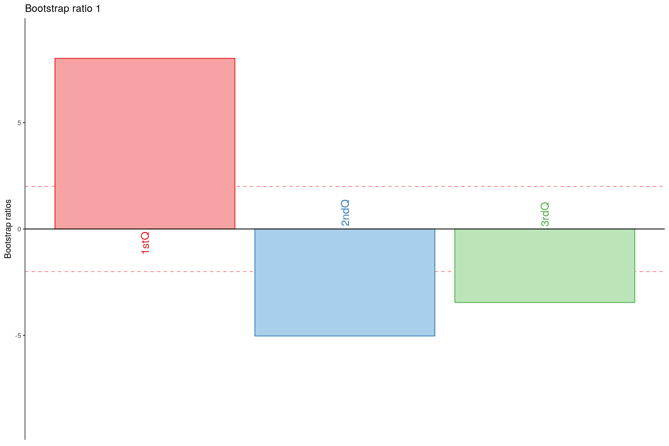
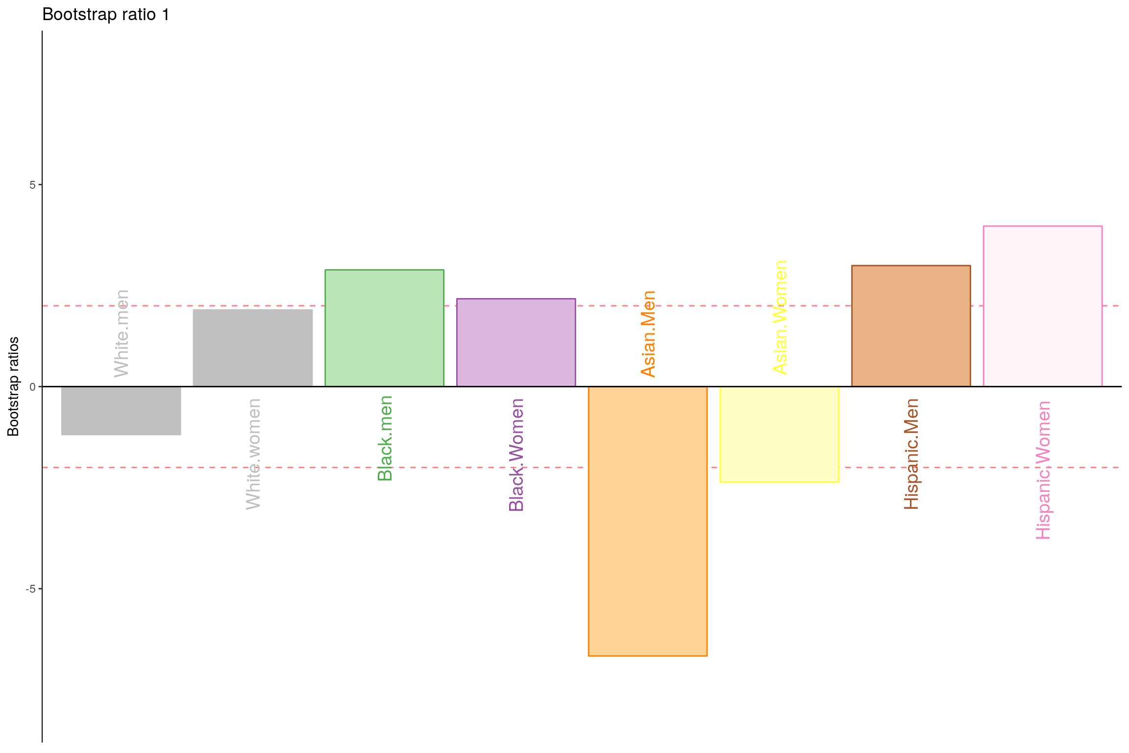
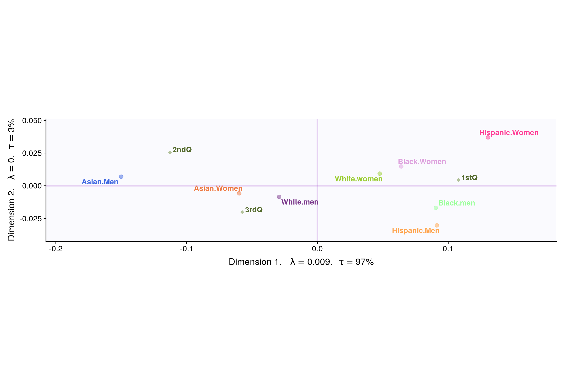
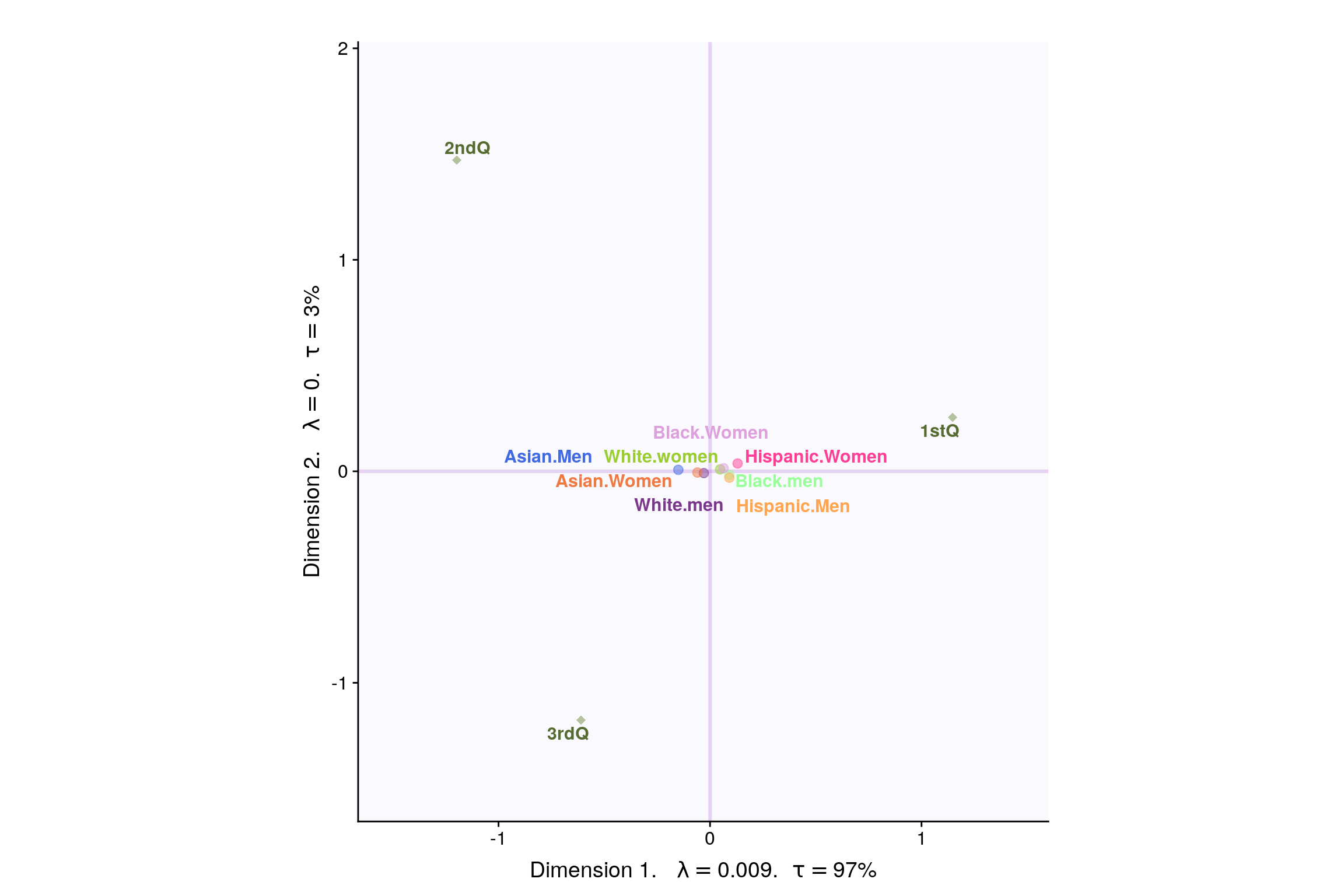
How to Interpret Correspondence Analysis Plots
Correspondence analysis does not show us which rows have the highest numbers, nor which columns have the highest numbers. It instead shows us the relativities.
- The further things are from the origin, the more discriminating they are.
- Look at the length of the line connecting the row label to the origin. Longer lines indicate that the row label is highly associated with some of the column labels (i.e., it has at least one high residual).
- Look at the length of the label connecting the column label to the origin. Longer lines again indicate a high association between the column label and one or more row labels.
- Look at the angle formed between these two lines. Really small angles indicate association. 90 degree angles indicate no relationship. Angles near 180 degrees indicate negative associations.
11.2 Dataset - Weekly earnings by Race
- Data: Measurements of Weekly Earnings per Race
- Rows: There are 6 observations representing Asian/White/Black, Men/Woman.
- Columns: Total 6 variables grouping people based on Decile and Quartile ranges of their weekly income.
##                             White.men White.women Black.men Black.Women
## 1st decile                        412         374       361         331
## 1st quartile                      594         506       483         423
## 2nd quartile                      920         743       680         615
## 3rd quartile                     1467        1140      1046         935
## 9th decile                       2278        1726      1551        1453
## Total people (in thousands)     48746       36698      6445        7142
##                             Asian.Men Asian.Women Hispanic.Men
## 1st decile                        420         385          358
## 1st quartile                      648         551          451
## 2nd quartile                     1129         877          631
## 3rd quartile                     1860        1411          979
## 9th decile                       2699        2024         1498
## Total people (in thousands)      3684        2954        11142
##                             Hispanic.Women
## 1st decile                             320
## 1st quartile                           404
## 2nd quartile                           566
## 3rd quartile                           830
## 9th decile                            1266
## Total people (in thousands)           7168
However, here we can see that it may not be advisable to include Quartile and Decile intervals in the same analysis. Hence, we go ahead with Quartile Ranges only.
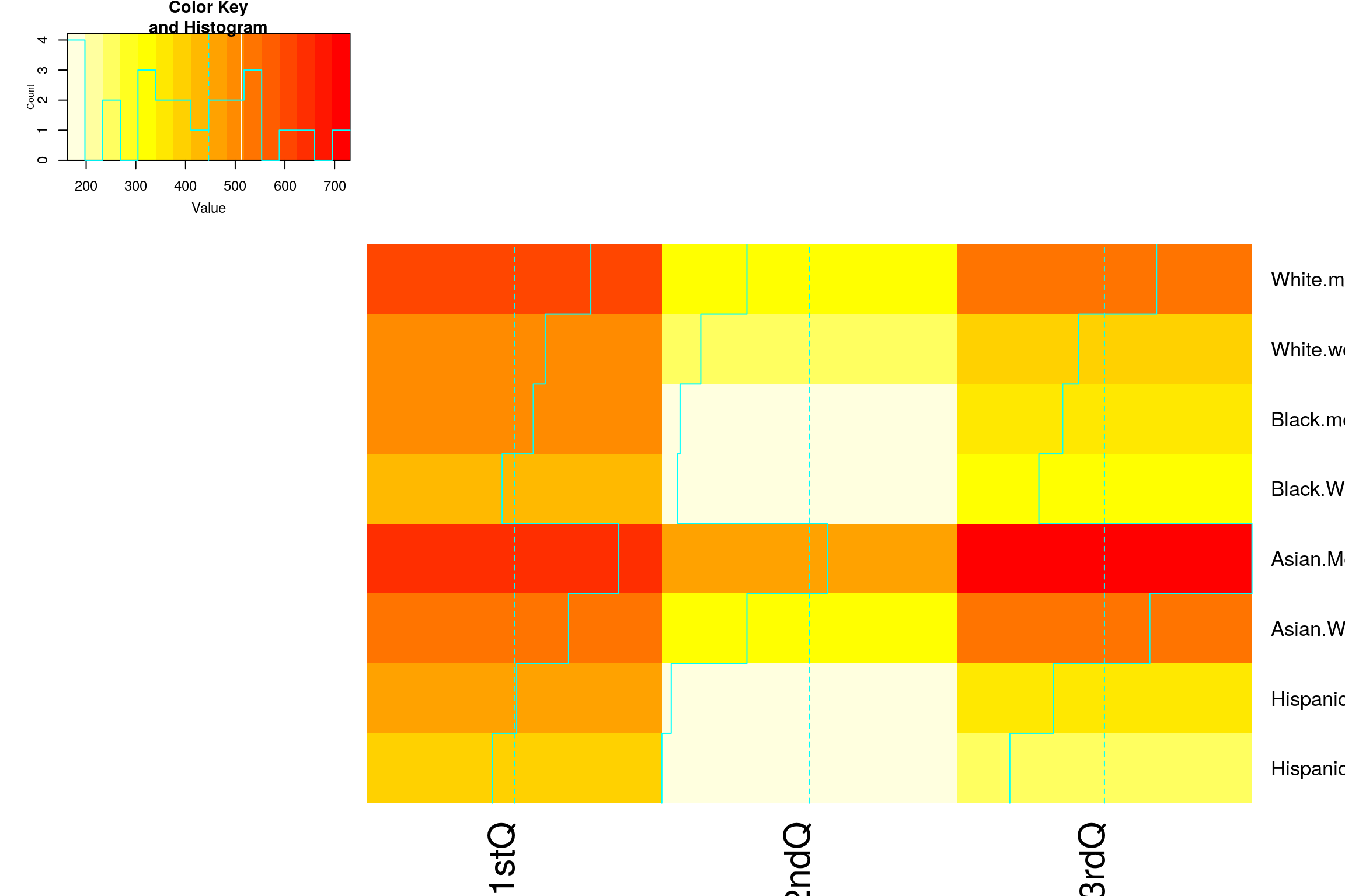
| 1stQ | 2ndQ | 3rdQ | |
|---|---|---|---|
| White.men | 594 | 326 | 547 |
| White.women | 506 | 237 | 397 |
| Black.men | 483 | 197 | 366 |
| Black.Women | 423 | 192 | 320 |
| Asian.Men | 648 | 481 | 731 |
| Asian.Women | 551 | 326 | 534 |
Research Question
- Does total earning of different races differ.
- Which race get less than median salary (2nd Quartile)
11.3 Heatmap
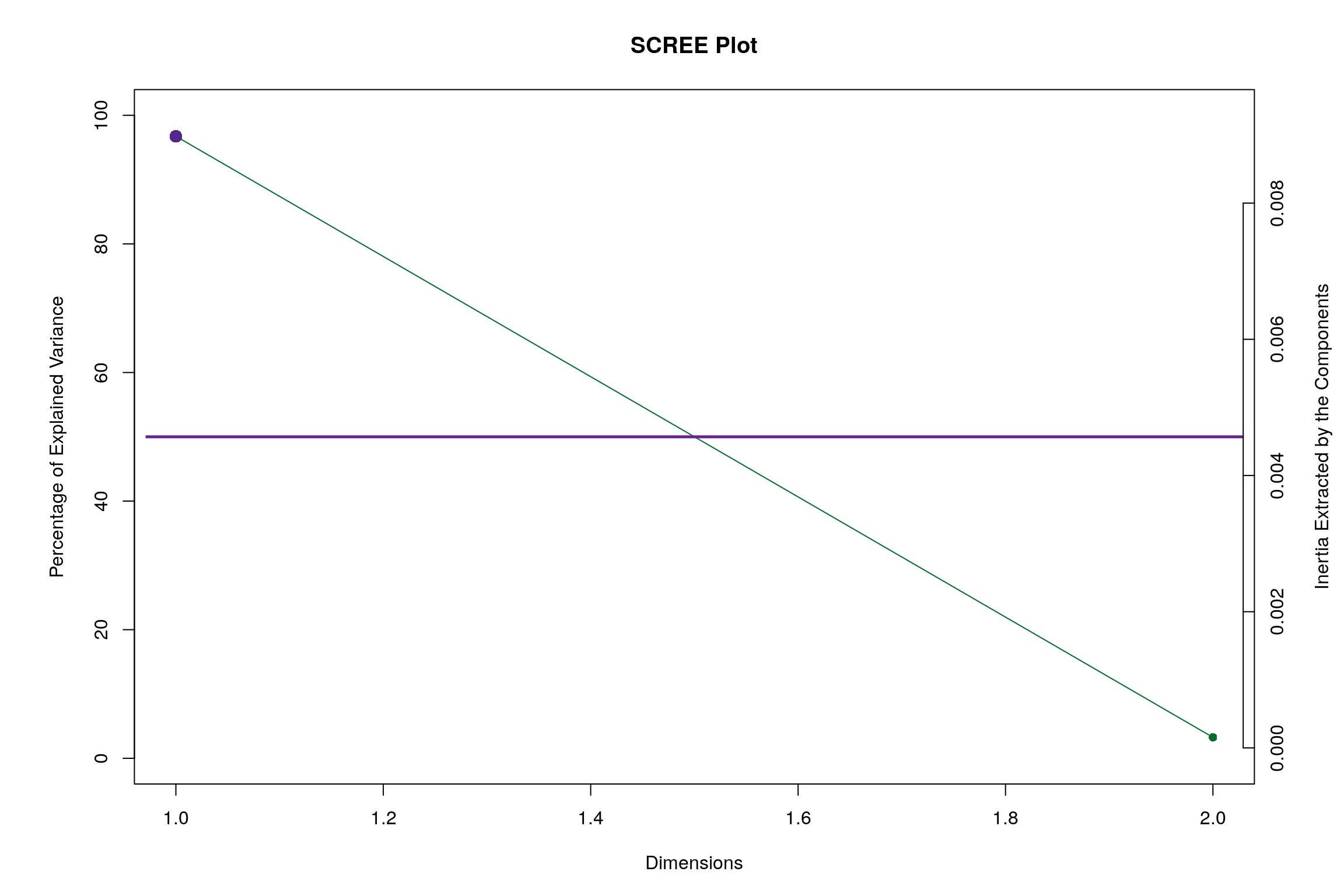
11.4 Scree Plot
Gives amount of information explained by corresponding component. Gives an intuition to decide which components best represent data in order to answer the research question.
P.S. The most contribution component may not always be most useful for a given research question.
11.5 Factor Scores
11.5.1 Symmetric Plot
11.5.2 Asymmetric Plot
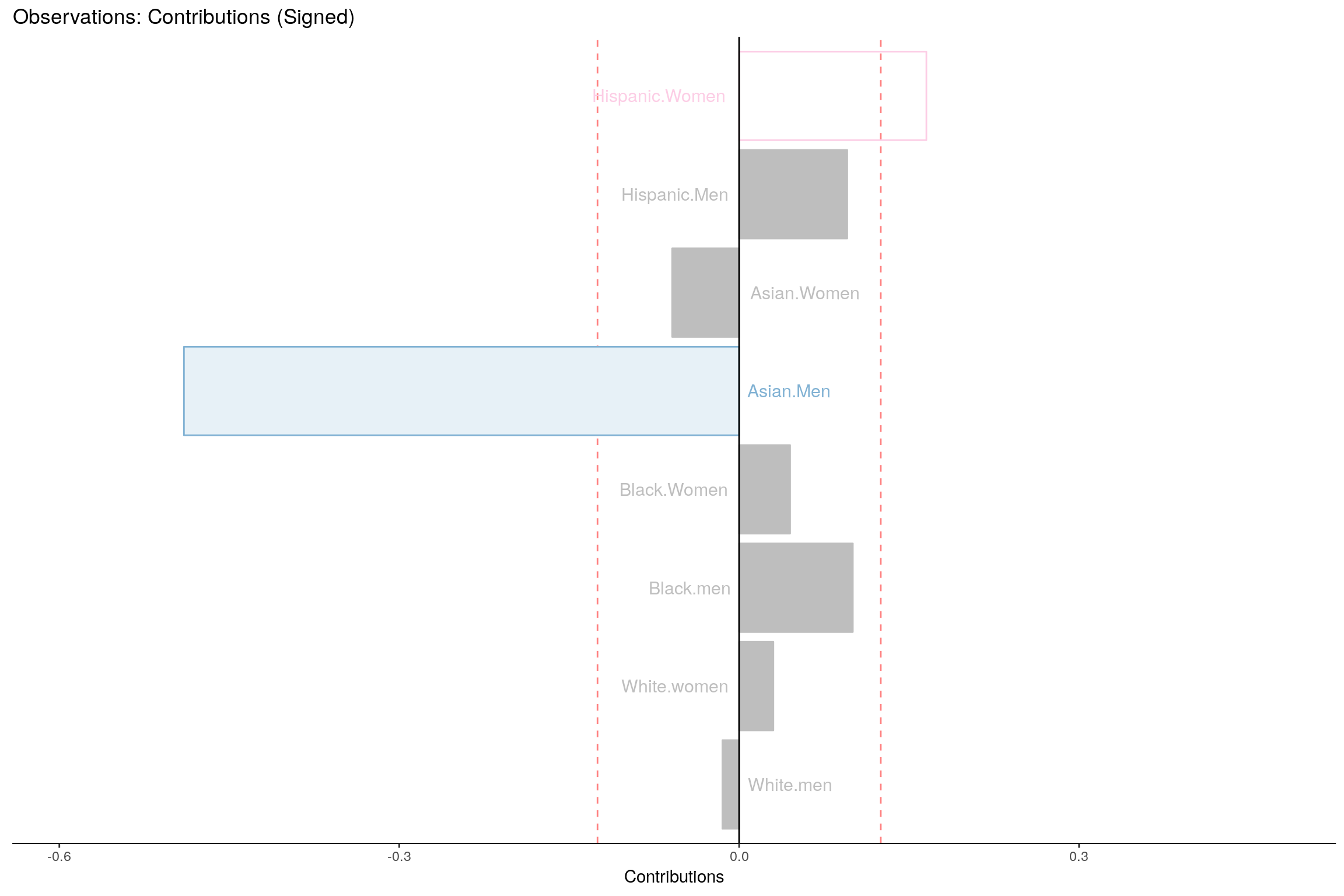
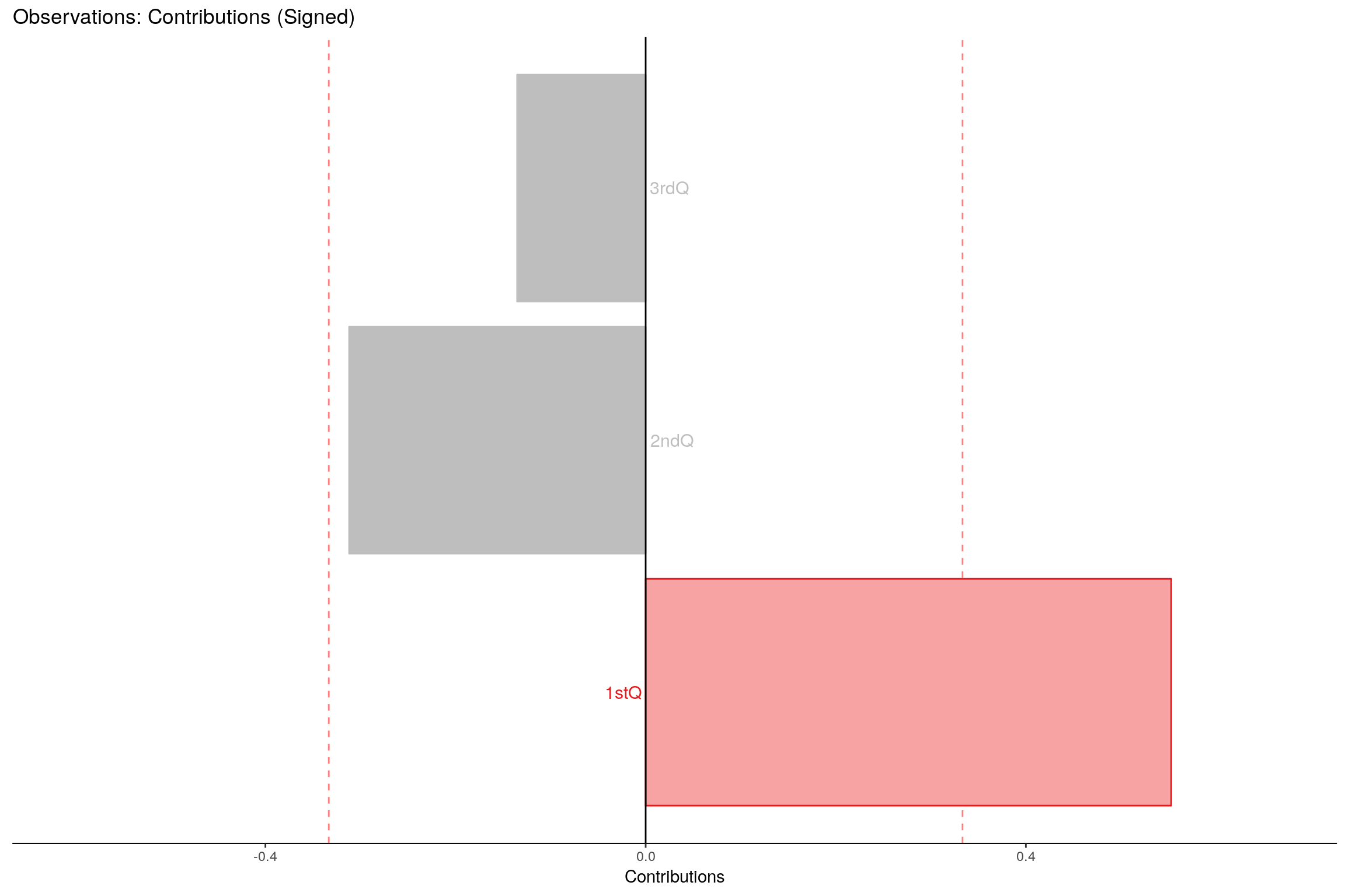
11.6 Most Contributing Variables
11.7 Inference CA